Extending the Thermodynamic Functions To Their Full Range: Functions vs. Pressure

While finishing up the process of generating the plots of the thermodynamic functions vs. pressure I found an issue with how plots are drawn on the x-axis when the x-axis has a logarithmic scale. I calculated numeric values for every pixel on the x-axis (including the first and last pixels), calculated the y-value from the appropriate function call, and then determined the x and y pixel locations by feeding the numeric values back into separate plot functions for each axis. The problem was, at least for logarithmic axes, that the pixel locations do not necessarily correspond to the pixels on which the original values are based.

In practice I think that the only one that differed was the final pixel, which I noticed because it plotted one pixel beyond the end of the x-axis, having skipped over two pixels rather than just one. For the time being I can head that occurrence off with a test that checks to see whether the pixel location is out of range while the value is within range and, if that happens, setting the pixel location to the rightmost edge. That works for now, but I definitely need to look more closely at how I do the plotting.

There are two ways to determine the pixel location on the x-axis. One is to simply march down the axis pixel by pixel and do the plotting based on the actual pixel location. The other is the way I did it, which is to feed that back through a plotting function, though that may lead to the kind of strange edge case I encountered here. Marching by pixel is great for continuous curves but not so great for more granular data. In those cases I need to be able to map a value on an axis to a pixel location in a reliable and consistent way. This is going to take some review and experimentation. I now have to review how the mechanisms work on both the x- and y-axes in both their linear and logarithmic forms. There is reason to believe that the method I have now will be sufficient (that turns out to be the case every now and then), but I need to be sure.

I also adjusted a little bit of the auto-spacing code, which wasn’t leaving enough space between the graph label and the top tick value label on the y-axis, and not enough space between the right edge of the plotting area and the right edge of the canvas in cases where no part of an x-axis tick value label extends beyond the end of the x-axis.

Next, a to-do item from yesterday involved ensuring that local minimum and maximum values get displayed, along with the formal beginning and ending values, if appropriate. (Remember that these issues are only germane to continuous curves. I finessed the problem yesterday by setting the range values for the x-axis to exactly those of the function, which were 32.018-705.44 °F. I did start the scale at 32.018 rather than 32.000 and merely suppressed the display of decimal points. It was then OK, if a bit unsatisfying, to not be able to display the high value (705.44) on the other end of the axis, since it either didn’t fit an even multiple or even multiples would have resulted in unattractive tick values. And those were some concerns when plotting on a linear scale. The way logarithmic scales work is even more complex. If I started with the true lower end of the scale, 0.08866 psi, then the tick values would be unattractive. Since I was working from a scale originally intended to run from 0.033 to 3300.0 psi, I left the value of 0.033 in place. As it is I appear to be stuck displaying data from the curves I defined for pressures lower than 0.0866 psi and 32.018 °F, though I could remove those segments from the functions that are currently defined. I’ve been loathe to do that, not wanting to lose the information (even if I can’t always remember how I came up with those fits), but at this point I’ve got enough copies of this stuff lying around that it shouldn’t be an issue. I suppose I could have gone with 0.088 as a starting value just as easily, and again suppressed the extra decimals (which may or may not work on a logarithmic scale), but I’m thinking that a more interesting solution is needed.

One possible solution is to set the extents of the axes in a way the results in attractive tick value labels, and then plot the function using a separate set of extents, which would at least guarantee that the interesting values at the beginning and end of the defined range are displayed correctly. This might not apply to every type of function, but some thermodynamic functions exhibit fairly severe behaviors right at the end of their ranges (especially when plotted against a logarithmic scale of pressure), so it was definitely on my mind during this exercise.

I’ve also been thinking that a way to ensure that more interesting features of graphs are captured when plotting continuous curves is to calculate values more often than once every pixel, so that extremely high or low values can be selectively plotted. I wouldn’t do such a thing for, say, a scrolling real-time plot, but for a presentation-quality plot it might make sense. Another possibility is specifying individual (independent) values that should be plotted, which can be drawn in place of whatever (independent) value falls closest when marching down an axis by pixel.

Again, there is much to consider.

Posted in Tools and methods | Tagged , , | Leave a comment

Extending the Thermodynamic Functions To Their Full Range

Today I extended all 24 functions to their full range, 0-705.44 °F and 0.08866-3203.6 psi. I’ve shown the functions vs. temperature; the functions vs. pressure are generally derived from the same lines in the steam tables so the only difference would be the values and units on the x-axis.

One problem that comes up is how to deal with endpoints or local extreme values. Continuous functions are written out pixel by pixel along the x-axis, so if the value chosen doesn’t happen to fall right on an endpoint or a local high or low value then part of the curve won’t be drawn. I’ve finessed this for today by defining the endpoints of the x-axis to coincide with the exact high and low values of the input range (i.e., the x-axis, with some tweaking by hand at the high end), which really isn’t satisfactory. I can think of a few things I might do but none make me very happy. I’m going to have to do some research and think about it a little more.

In the meantime, here are the full plots vs. temperature, and the plot of temperature vs. pressure as a representative example.

Posted in Tools and methods | Tagged , , | Leave a comment

Fixing the Thermodynamic Functions for Saturated Water As A Function of Temperature

I’ve updated five of the thermodynamic property functions vs. temperature. Note that most of these define properties only up to a bit above 600 °F and, more importantly, to 1800 psi. The values for saturated water are defined up to 705.44 °F and 3204 psi. I only fit the curves to the values I did because I was modeling systems in a boiling water reactor (BWR), which runs at not more than 1200 psi. Pressurized water reactors (PWR), by contrast, run up to around 2000 psi. It would be a good idea to extend all of the curves vs. both temperature and pressure to their maximum values.

The specific volume functions were both updated.

The enthalpy of vapor function was updated.

The entropy of vaporization and vapor functions were also updated.

Of further note was that I found a more advanced version of the curve fit program I used back when. It not only had more features and was a bit easier to use but also supported extra terms for polynomial powers of four through seven. It’s generally better to use polynomial functions than it is to use more expensive functions like square root and natural logarithm, especially if the multiplications are written out efficiently.

The automatically generated function code did not make use of the technique, but it’s possible to write out a polynomial function of the form:

Result = A + Bx + Cx2 + Dx3 + Ex4

in code as:

Result = A + x * (B + x * (C + x * (D + E * x)))

This has the advantage of requiring far fewer multiplications and additions than the method I have used.

I’ll have to do some reverse engineering to figure out what I was doing with the different versions of the curve fit program before putting together a new one. I had four or five versions altogether, the last of which seemed to be incomplete.

Posted in Tools and methods | Tagged , | Leave a comment

Testing the Thermodynamic Functions for Saturated Water As A Function of Pressure

I was getting ready to do new curve fits on all the segments of the thermodynamic functions that seemed to require it. However, I realized that I hadn’t yet plotted them all out as a function of pressure since I finished making logarithmic scales work. Ergo, the figures below.

Except for the previously discussed chicanery regarding values at very low pressures and temperatures (below the triple point at 32.018 °F and 0.08866 psi), that I built in for use in a specific model from data and for reasons I can’t remember, this set of functions didn’t seem to include any obviously wayward segments.  That said, I might revisit the segments between 180 and 1800 psi for a couple of the functions.  At the very least I’ll plot them on larger graphs and as isolated segments to enhance the available detail.

As an aside, I also noticed that most of the curves didn’t seem to be plotting out their final value at the far right pixel on each graph. This got me a bit frustrated because I thought I’d fixed that. However, the issue turned out to be our old friend the rounding error, which I had fixed for one of the functions (Temperature vs. pressure, which is evident in the first figure here) by adding a tiny buffer to the range the segment equation applied to (1800.0000001 rather than just 1800.0). This arises when performing successive additions to the independent variable as the drawing function traverses the x-axis pixel-by-pixel and ends up with a value of something like 1800.000000000036, which would fail the test of being less than or equal to the maximum value that could be plotted on the chart (1800.0). If the curve (or the function that defines it) continued beyond the high value for the graph then there wouldn’t be a problem, but in this case the high value for the graph and the curve were the same.

I believe that the solution to this problem, rather than adding a nudge to the curve definition (e.g. 1800.0000001), I might add a test to see if the final value is some tiny fraction over the maximum value and then bump it back, though such a solution might not always be appropriate if I don’t know much about the function being plotted. When I did the nudge for plotting the final major tick at the end of an axis I knew that I was looking for a whole number near seven, so the solution was appropriate. In this case it might not be. I’ll have to think about it for a while.

The bottom line, however, is that someone employing these tools has to be aware of all the edge cases. I try to address as many as I can in the code, but the code can’t always catch everything. This is especially true as new users employ new use cases that haven’t yet been encountered.

Posted in Tools and methods | Tagged , | Leave a comment

Adding to the Graphing Capabilities

As you saw yesterday in the figure below, I’ve added the ability to plot individual points on the graph rather than a continuous function.

The x- and y- locations are determined independently by transforming a value to a pixel location against each axis. The axis to use has to be supplied to the plotting method, which is part of the Graph class. If a point (or curve) is to be scaled to a secondary axis or, indeed, any axis, a reference to that axis must be supplied to the plotting function. The plot function is a member of the Graph class, as stated, and the scaling functions for the axes are part of the axis class.

Ideally, what you have then is a procedure with the following steps:

  1. Perform any initialization for curves, processing of arrays, association with functions and ranges, and so on.
  2. Determine the x,y values to be plotted.
    • If the function to be plotted is continuous then determine the value pairs for some or all of the pixels on the x-axis (or whatever axis is associated with the independent variable).
    • If the function to be plotted from a known set of independent values then find the dependent values which correspond to them by executing the desired function.
    • If the values to be plotted come from an already known set of x,y value pairs then arrange them into a data structure that allow them to be processed.
  3. Determine the pixel locations against the appropriate x- and y-axes independently.
  4. Perform the desired drawing operation based on the pixel location.
    • If the function to be plotted is continuous then the curve will be extended with each successive operation.
    • If the function to be plotted is based on individual data points (e.g., supplied from a list) then the individual symbols (or bars or whatever) will be drawn (or lines connected from point to point). Volumes may be filled in as required.

When I did the original quick and dirty hack I just buried some of the steps into the main method where the graph is drawn, but in truth the graph itself should be drawn by one method and the plotting functions should be called by using entirely separate methods.

Right now there is a function for step 1 to initialize continuous graphs.  There is a sweep method for the continuous functions which embodies steps 2, 3, and 4, calling the scale and plot functions as needed.  For individual data points the values are fed to the required methods individually (step 2), and then the scale/transform (step 3) and drawing operations (step 4) are called successively for each data pair.

I’m still working on ways to compartmentalize some of these functions.  I want them to be as consistent as possible while also being callable from outside the method that draws the graph itself.  As I think about it, the design I have is actually pretty close to what I think I will ultimately need, but I will continually revisit it as I find new ways to use the object and implement more different kinds of plots.

Posted in Tools and methods | Tagged , | Leave a comment

Steam Table Functions, Curve Fitting, and Yes, the Graph Project

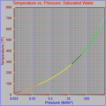
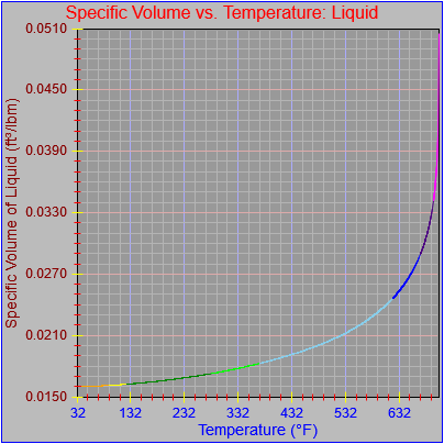
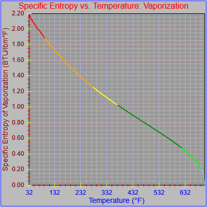
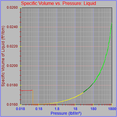
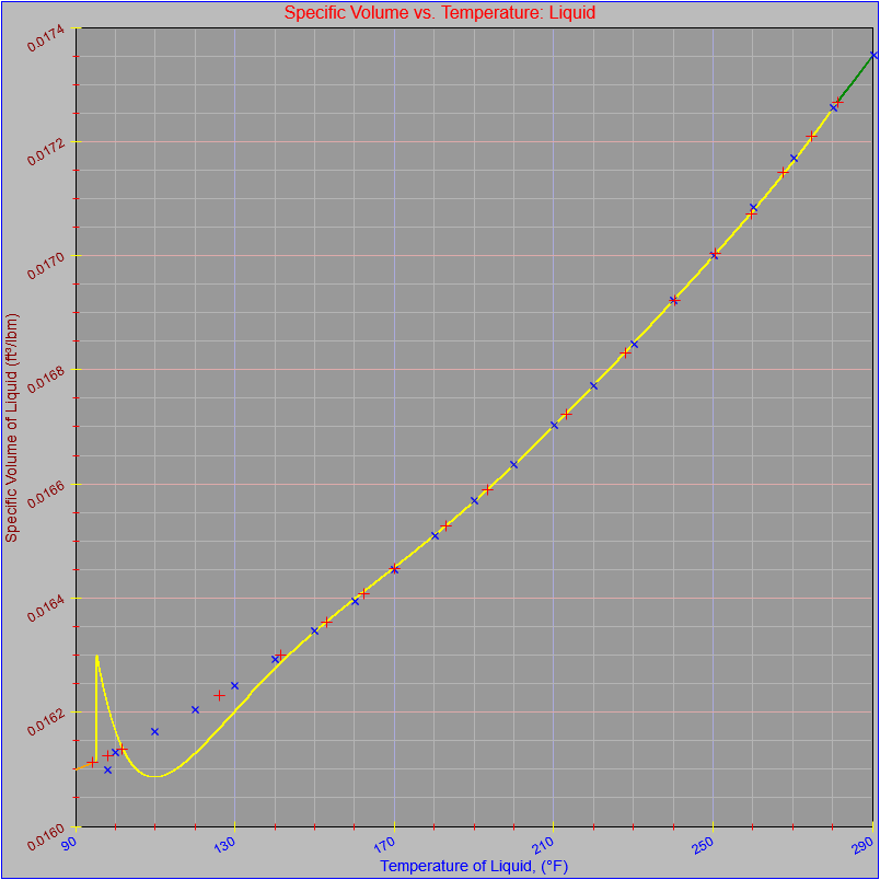
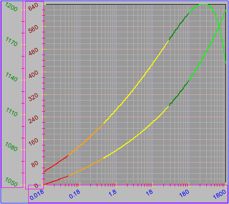
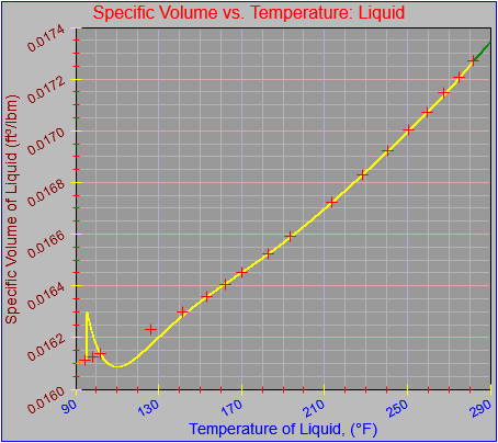
I’m finally detouring back to fixing the handful of errant segments in the steam table functions I created for my simulation work in the early 90s. This graph, originally posted on March 16th, shows a hiccup in the segment from 95 °F to 281.03 °F:

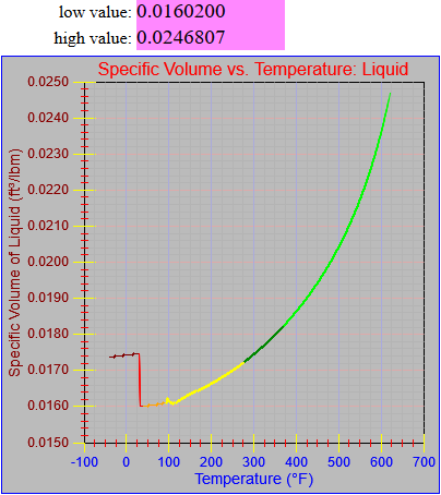
The first thing I did was plot the offending function segment using the graph object I’ve been working on. However, in this case I’ve added values taken from the steam tables at ten degree intervals. Most of the graph is fine except for the low end.

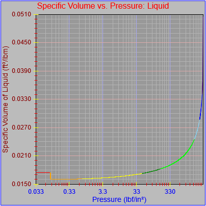
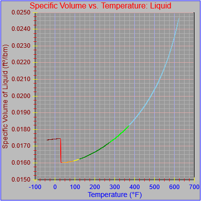
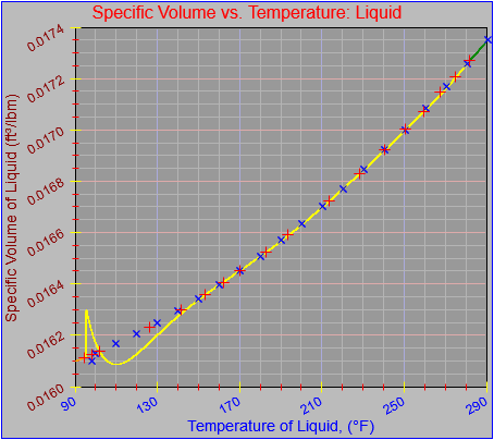
Recognizing that I originally built the function from entries that came from the pressure table (meaning that the values for the different properties are reported at even intervals of pressure, so the temperature values were unevenly spaced) so I would be using consistent ranges and possibly control points (more on that shortly), I went ahead and plotted the values from the pressure table instead, as shown here.

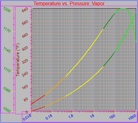
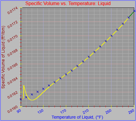
For completeness and then clarity I plotted both sets of values as shown here, first in a normal size, and again in a much larger size, which I have made scrollable.

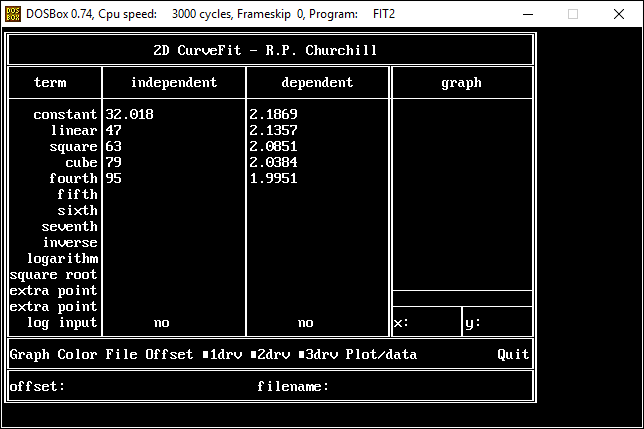
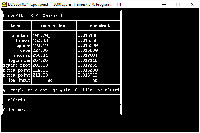
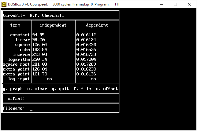
The locations of the red crosses on larger plot suggest which control points I used when I did the original fit. The fit program I used, several captures of which are shown below, works by solving a system of simultaneous equations of the following form:

Dep = A + B*Ind + C*Ind2 + D*Ind3 + E/Ind + F*LN(Ind) + G*SQRT(Ind)

where Ind and Dep are the independent and dependent variables (in this case temperature and specific volume of liquid) taken from the steam tables and A through G are coefficients that are solved for. The theory is that once you solve for the coefficients you can use the equation and an input value to generate an output value. Including a variety of terms of different forms captures many potential characteristics of the function.

I got the idea from an article that was passed to me at my first engineering job at Sprout-Bauer. I can’t remember where it came from, exactly, but I want to recall that it was from a magazine from the paper industry or chemical engineering. It described a function that either existed on or was implemented on a TI-59 calculator. Having seen the article I busted out my trusty copy of Turbo Pascal and went to town.

The program I wrote implemented a few extra twists. It included the ability to apply a LN function to the independent variable before it was entered into the equation and also the ability to apply a LN function to the result. That often helped smooth out some otherwise unruly curves. It also had the ability to add an offset to the input value, the intention of which was to subtract a fixed value from the independent values to make the fit start at a value close to zero. That is, instead of trying to do a fit from 459,624,593.006 to 459,624,604.731 you could subtract most of the value from the input so the fit would be from, say, 1.0006 to 10.731. In theory this would allow the computations to preserve more significant figures, which was important when you were working with only 32-bit floating point numbers.

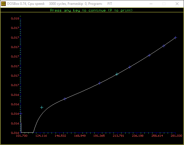
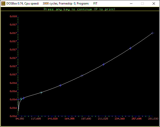
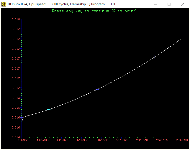
Finally, the user could enter values in for some or all of the terms, and terms that were omitted were not used in the curve fit or the resultant equations. Once the calculations were done the program could plot the results (as shown below) and write out the functions or coefficients in various forms. The control points used, which correspond to the independent and dependent value pairs that were used as inputs to the system of simultaneous equation that gets solved for the coefficients, are plotted in dark blue on the graphs. The resultant function should pass through all of the control points. It’s what happens between the control points that gets interesting. Up to two extra points could be plotted in light blue, to show how much error might be creeping in.

I obviously set it up to write the function out in Pascal, but the thing could be made to write things out in any language desired. I may have to recreate the thing so I can get it to work more efficiently on a modern OS without having to run it in the DOSBox emulator, but I will revisit that idea down the line. Recreating the pouring demo was a bit of a slog already.

I went ahead and tried to recreate the function with the following results. In each successive attempt I chose a greater concentration of control points near the lower end of the range. The form of the original function I derived shows that I used all seven available terms so I’ve done the same here.

Attempt 1:

Attempt 2:

Attempt 3:

I also tried applying LN functions to the independent and dependent values but they didn’t solve the problem, either.

As you can see, this particular function does not want to behave. There are a few simple workarounds, however. One is to simply break the function into two or more ranges. Another is to use this function only for the range where the fit is good and extend the next lower range up to cover the missing range. Doubtless there are other solutions.

Going forward I’ll work through some of the other problematic functions and talk more about the curve fitting process, though tomorrow I will probably take time out to discuss the updates I made to the graph object.

Posted in Tools and methods | Tagged , , , | Leave a comment

Graph Project: Updated To Do List

At this point I need to change direction and get back to addressing the issues which led me to create the JavaScript graph object in the first place. I’ve got enough solid functionality in place to proceed, and I’ll add features in as I need them, but for today I’m simply leaving this list of additional features to add.

I did knock one thing off the list today, which was a fix for those occasions when inescapable rounding errors lead to the final major tick not being drawn at the far end of an axis as it should be. Floating point representation in binary (presumably in two’s-complement with exponents) cannot express all round numbers exactly, so you may get results like (0.0174 – 0.0160) / 0.0002 = 6.9999999999999992 instead of 7.0 or something like 7.0000000000000004. If the number of major ticks is exactly at or a hair over a round number the final tick will land at the end of the axis and no one will care. If it is at all lower, however, then the final major tick would not be drawn. Therefore, I simply added a check to see if the difference between the calculated number and rounded number of ticks was in a very tiny range (0.0 < difference < 0.000000000001), and rounded the value if necessary, which took care of the problem handily.

Anyway, here is the list. Tomorrow it’s back to examining the segments of the thermodynamic functions and talking about how the curve fits for them were done.

  • Once the axis elements are reworked the ability to click on the related area should be added, as a way to kick off user modification processes.
    • Currently they are just calculated on the fly to draw bounding boxes for demonstration purposes.
  • The axis itself should be drawn based on where it intersects an axis perpendicular to it, by value for that axis and not by pixel.
  • It’s possible that ticks should be drawn close to the tick labels and on an axis display in the middle of a plot area. Maybe.
  • In theory, no more than one axis in either direction should be able to be drawn somewhere in the middle of the plot area, away from its labels.
  • Define outer edges of graph object independent of canvas object.
    • ALL locations will have to include an extra offset from the origin of the sub-area.
    • A bounding box should be able to be drawn or not drawn as desired.
  • Eliminate outer edge buffer definitions.
  • Add graph legend.
    • Assume default location of right edge.
    • Ultimately allow it to be placed arbitrarily.
  • Allow graph title to be placed arbitrarily.
  • Support reversal of any axis.
  • Make use of auto-scaling function that has been written.
  • Eliminate specification of both inner and outer scale ranges. The need for that has been obviated by the auto-scaling feature.
  • Allow axes to start on arbitrary, non-tick boundaries as well as end on them.
    • May not apply to axes with logarithmic scales.
  • Have tick value labels consider size of descenders for non-numeric labels.
    • Consider doing this automatically based on content of labels.
  • Support multi-line axis labels
  • Support multi-line graph label.
  • Add switches to further govern the drawing of tick value labels
    • None
    • All
    • First and last only
  • Add switches to suppress drawing of other aspects of the axis
    • The axis line itself
    • The ticks (already done?)
    • The plot area lines (already done?)
    • The far edge of the plot area (if another axis has not already been specified for that location.
    • The near AND far edge lines if the axis is defined so it falls inside the plot area and not at the edge.
  • Support staggered drawing of x-axis labels only at zero degrees of rotation
    • Do this automatically if labels too long for space available
  • Add ability to draw major ticks between labels.
    • Only for text labels on x-axis?
    • This would presumably eliminate drawing of minor ticks.
  • Add ability to draw extra labels at arbitrary locations in plot area.
  • Add ability to draw plots as x-as-a-function-of-y. This effectively rotates plots 90 degrees clockwise for the ability to scroll vertically and plot things the way economists sometimes do.
  • Add more plot mechanisms (that leverage already modular plotting mechanism).
    • Plot from table entries rather than from continuous functions.
    • Plot from continuous functions that don’t include cyclic color information.
    • Add lines, scatters, bars, box-and-whisker plots (and outliers), stock plots, plots where symbol size and color provide additional meaning, etc.
    • Add horizontal and vertical range lines (to illustrate ranges, things like run plots as used in quality analysis, warning limits on scrolling graphs, and asymptotes).
    • Add ability to handle parametric function plots that aren’t simply y-as-a-function-of-x.
    • Add plot/symbol legends.
  • Add animation, scrolling, real-time, and data features.
    • Add ability to have scrolling graph update interactively as new data is added (real-time scrolling).
    • Plot series data as non-scrolling animation.
    • Have graph object modify or extend animation features as new data are received through a receiver function.
    • Have graph object be able to record data received through a receiver function. Include time stamps with data.
    • Have object be able to recall and review recorded data and meta-data.
    • Allow user to select with data stream or streams are to be reviewed and displayed.
    • Make recall/review functions work across files split by time period or other method.
  • Make graph objects movable and able to be interactively displayed, hidden, and dismissed.
    • Graphically within a single canvas. Would need to save information it covers while moving or displaying.
    • Entire canvas object within a DOM page.
  • Add user interactivity, especially as ability to select elements by mouse click and use menus and dialogs to effect modifications. Especially may need to allow selection of plot elements in graphing area.
    • Add UI support for interactive modification of graph element parameters. Probably use tabbed dialogs. Could be in separate window, expanded or slideout region, or popup.
    • Place more limits on values that can be assigned to various parameters (e.g., angle of rotation of tick value labels only between -90 and +90 degrees).
    • Include a flag to indicate when any element is modified that may require re-spacing other element or otherwise redrawing the graph. This may not be needed because that logic can be handled in various places.
    • Add ability to scroll across larger data set (at least horizontally) under user control.
    • Add ability to zoom in or out on x-axis scale.
    • Add ability to zoom in or out on y-axis scale.
    • Add ability to modify values by dragging plotted elements?
  • Incorporate general enhancements.
    • Add support for additional fonts and font sizes over 30px.
    • Add arbitrary text comments and pointers.
    • Add ability to include user-defined symbols or images (e.g., Steve Martin’s rubber chicken graph).
    • Add transparency and ability to draw over (arbitrary/user-supplied) background image.
    • Save graph description as a list of parameterized elements by x- and y-coordinates and other properties to they can be redrawn after arbitrary rotations in two or three dimensions. Requires transform between plot space and display space and separate means of storage for both.
    • Provide ability to print graphs.
    • Provide ability to save graphs as images.
    • Provide ability to save (and read) graph as XML specification.
    • Make occasional passes through code to improve efficiency and clarity.
Posted in Tools and methods | Tagged , | Leave a comment

Graph Project: Show or Hide Graph and Axis Labels

The figures below show that the graph and axis labels can be hidden or shown independently.

Posted in Tools and methods | Tagged , | Leave a comment

Graph Project: Auto-Sizing Works — The Hard Part, Part Two

Today’s work involved getting the plot area to size itself properly when the last major tick on an axis does not fall right at the end of the axis. It turned out to be just a bit complex and it did involve iteration, as expected, but the number of iterations appears to remain small. I will doing further testing in the future to see, for example, how many iterations might be needed to handle three axes in one direction that all end in partial cycles. I’m also wondering if it is possible for the solution I developed to exhibit a “chatter” effect, where the iterations continue as the sizing result jumps back and forth by a pixel or two. I will report back if I find anything.

In the meantime the following images show how adjustments to the secondary y-axis scale, which ends in a partial cycle (between major ticks) ultimately allows it to become the element that governs spacing for the top edge of the plot area.

As a side note I identified the need to fix the plotting on the y-axis so it did not overrun the plotting area by one pixel on the high end. The third image shows the correction.

Also, notice that for the time being the solution only works for axes increasing in value from bottom to top (for the y-) and left to right (for the x-), where the partial cycle can only occur at the high end of the scale. There are two possible complications to the current set-up. One is that I can (and ultimately will) add the ability to reverse the direction of the scale on any axis. That would mean that the partial ending cycle would be at the bottom of a y-axis and the left side of a right axis. The other possible complication, which I may or may not ever address, involves the ability to define a scale that does not begin on a major tick boundary. That situation might come up if I want to generate a graph like this (from the Lissajous Curve app by Ying-Chou Sun, found in the iTunes App Store), though in reality it does end at major ticks:

As I’ve noted previously, I do plan to allow axes to take up arbitrary positions within the plotting area, as they do in this example.

Posted in Tools and methods | Tagged , | Leave a comment

Graph Project: Auto-Sizing Works — The Hard Part, Part One

Today’s updates involve ensuring that any number of axes can be properly placed on any side of the plotting area. Moreover, they will include space for tick marks that extend beyond the location of the axis itself.

I also corrected a couple of other minor issues. One was forgetting a beginPath statement before drawing bounding rectangles (they normally wouldn’t be drawn except as an illustration), which had the effect of changing the color of the last major tick drawn on every axis. You see it corrected in the final image below. The other was realizing that there was not a one-pixel overlap between the space required for the graph label at the top of the canvas and any elements that bordered it, it only seemed that way because the bounding box was drawn one pixel too low.

The first figure shows that the overlap with the top section is now corrected, and also that the spacing works as desired with the x-axis in the low position as well as the high.

The next figure shows that multiple axes can be placed on any side of the plot area and be spaced correctly. I initially thought it was going to more complex than it turned out to be, but I happily saw a way to insert just a few extra lines of code into an existing block.

The final figure shows that spacing of multiple axes on any one side of the plot area will properly allow space for ticks that extend inside an axis (axisTickStyle == “in” or “both”) and that the issue with accidentally changing the color of the last major tick has been corrected.

The last thing to do for this phase of development is extend the code so it properly handles cases where the final major tick does not fall at the end of an axis. That should be addressed tomorrow.

Posted in Tools and methods | Tagged , | Leave a comment