While finishing up the process of generating the plots of the thermodynamic functions vs. pressure I found an issue with how plots are drawn on the x-axis when the x-axis has a logarithmic scale. I calculated numeric values for every pixel on the x-axis (including the first and last pixels), calculated the y-value from the appropriate function call, and then determined the x and y pixel locations by feeding the numeric values back into separate plot functions for each axis. The problem was, at least for logarithmic axes, that the pixel locations do not necessarily correspond to the pixels on which the original values are based.
In practice I think that the only one that differed was the final pixel, which I noticed because it plotted one pixel beyond the end of the x-axis, having skipped over two pixels rather than just one. For the time being I can head that occurrence off with a test that checks to see whether the pixel location is out of range while the value is within range and, if that happens, setting the pixel location to the rightmost edge. That works for now, but I definitely need to look more closely at how I do the plotting.
There are two ways to determine the pixel location on the x-axis. One is to simply march down the axis pixel by pixel and do the plotting based on the actual pixel location. The other is the way I did it, which is to feed that back through a plotting function, though that may lead to the kind of strange edge case I encountered here. Marching by pixel is great for continuous curves but not so great for more granular data. In those cases I need to be able to map a value on an axis to a pixel location in a reliable and consistent way. This is going to take some review and experimentation. I now have to review how the mechanisms work on both the x- and y-axes in both their linear and logarithmic forms. There is reason to believe that the method I have now will be sufficient (that turns out to be the case every now and then), but I need to be sure.
I also adjusted a little bit of the auto-spacing code, which wasn’t leaving enough space between the graph label and the top tick value label on the y-axis, and not enough space between the right edge of the plotting area and the right edge of the canvas in cases where no part of an x-axis tick value label extends beyond the end of the x-axis.
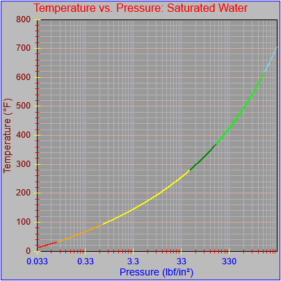
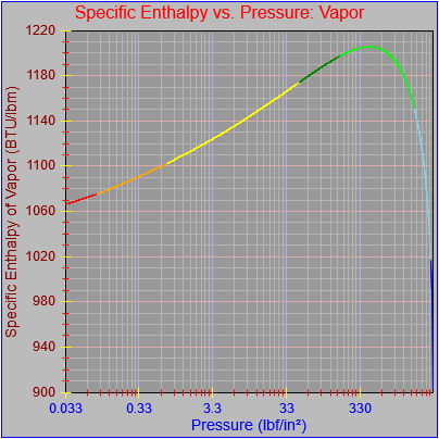
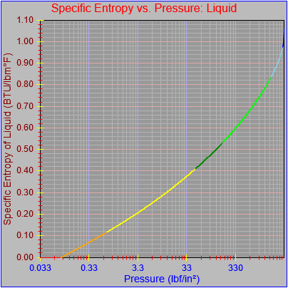
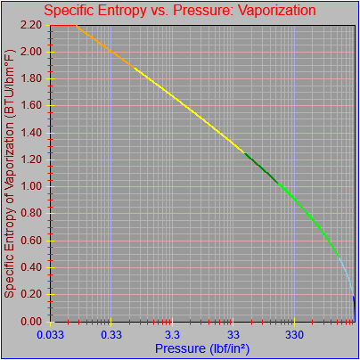
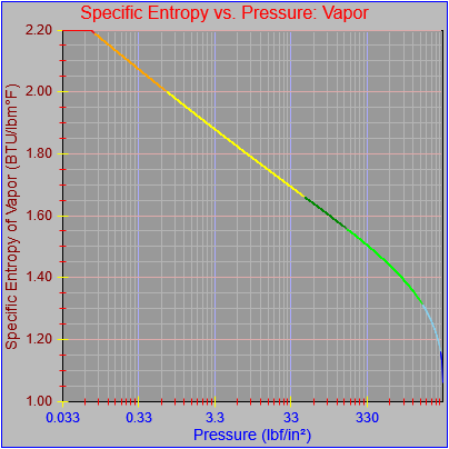
Next, a to-do item from yesterday involved ensuring that local minimum and maximum values get displayed, along with the formal beginning and ending values, if appropriate. (Remember that these issues are only germane to continuous curves. I finessed the problem yesterday by setting the range values for the x-axis to exactly those of the function, which were 32.018-705.44 °F. I did start the scale at 32.018 rather than 32.000 and merely suppressed the display of decimal points. It was then OK, if a bit unsatisfying, to not be able to display the high value (705.44) on the other end of the axis, since it either didn’t fit an even multiple or even multiples would have resulted in unattractive tick values. And those were some concerns when plotting on a linear scale. The way logarithmic scales work is even more complex. If I started with the true lower end of the scale, 0.08866 psi, then the tick values would be unattractive. Since I was working from a scale originally intended to run from 0.033 to 3300.0 psi, I left the value of 0.033 in place. As it is I appear to be stuck displaying data from the curves I defined for pressures lower than 0.0866 psi and 32.018 °F, though I could remove those segments from the functions that are currently defined. I’ve been loathe to do that, not wanting to lose the information (even if I can’t always remember how I came up with those fits), but at this point I’ve got enough copies of this stuff lying around that it shouldn’t be an issue. I suppose I could have gone with 0.088 as a starting value just as easily, and again suppressed the extra decimals (which may or may not work on a logarithmic scale), but I’m thinking that a more interesting solution is needed.
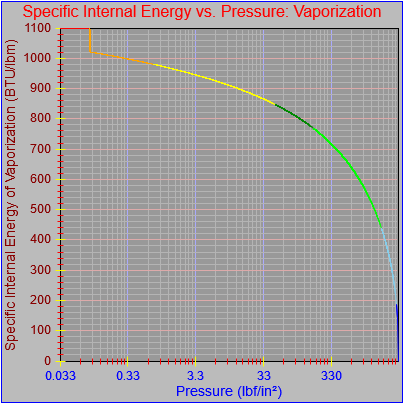
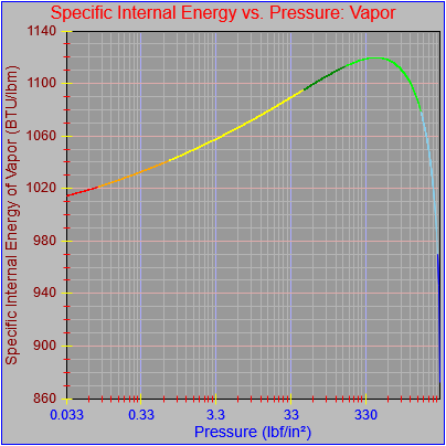
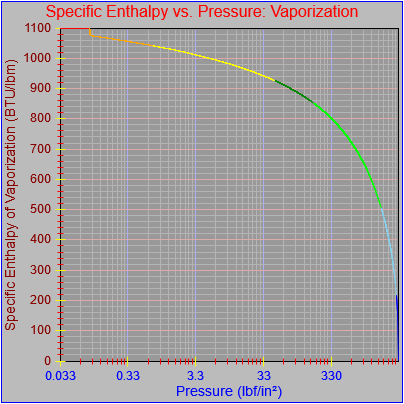
One possible solution is to set the extents of the axes in a way the results in attractive tick value labels, and then plot the function using a separate set of extents, which would at least guarantee that the interesting values at the beginning and end of the defined range are displayed correctly. This might not apply to every type of function, but some thermodynamic functions exhibit fairly severe behaviors right at the end of their ranges (especially when plotted against a logarithmic scale of pressure), so it was definitely on my mind during this exercise.
I’ve also been thinking that a way to ensure that more interesting features of graphs are captured when plotting continuous curves is to calculate values more often than once every pixel, so that extremely high or low values can be selectively plotted. I wouldn’t do such a thing for, say, a scrolling real-time plot, but for a presentation-quality plot it might make sense. Another possibility is specifying individual (independent) values that should be plotted, which can be drawn in place of whatever (independent) value falls closest when marching down an axis by pixel.
Again, there is much to consider.