Graph Project: Auto-Sizing Works — The Hard Part, Part Two

Today’s work involved getting the plot area to size itself properly when the last major tick on an axis does not fall right at the end of the axis. It turned out to be just a bit complex and it did involve iteration, as expected, but the number of iterations appears to remain small. I will doing further testing in the future to see, for example, how many iterations might be needed to handle three axes in one direction that all end in partial cycles. I’m also wondering if it is possible for the solution I developed to exhibit a “chatter” effect, where the iterations continue as the sizing result jumps back and forth by a pixel or two. I will report back if I find anything.

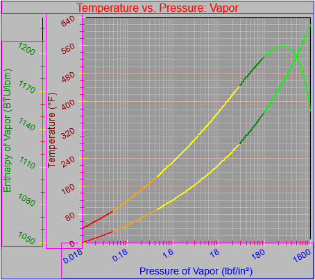
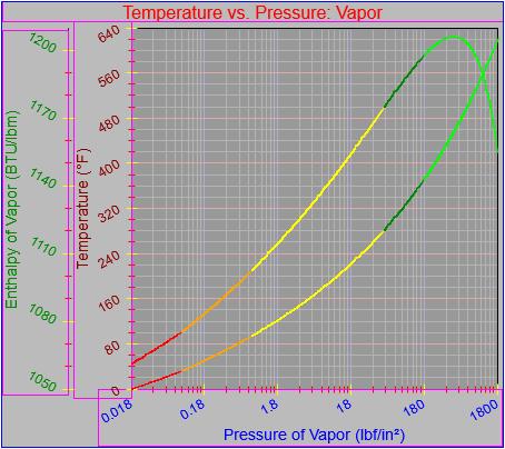
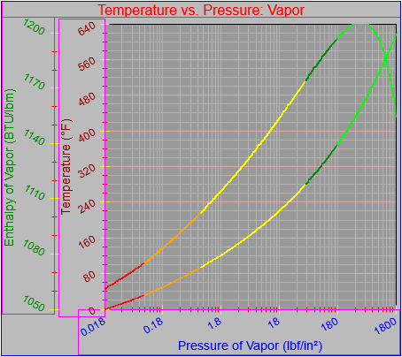
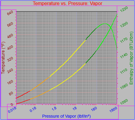
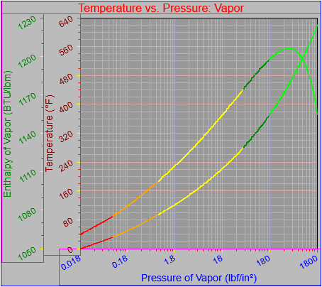
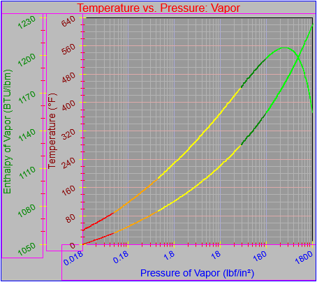
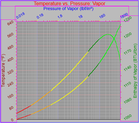
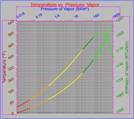
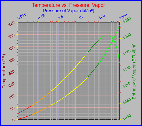
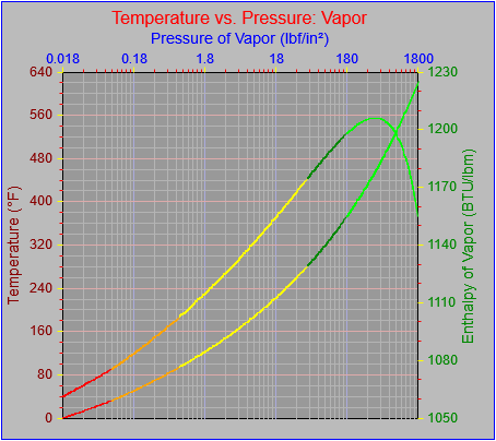
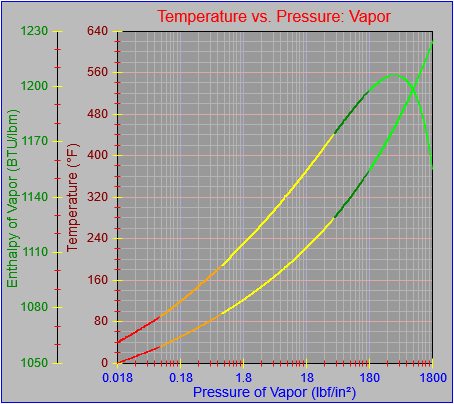
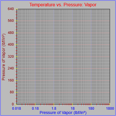
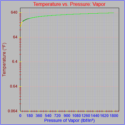
In the meantime the following images show how adjustments to the secondary y-axis scale, which ends in a partial cycle (between major ticks) ultimately allows it to become the element that governs spacing for the top edge of the plot area.

As a side note I identified the need to fix the plotting on the y-axis so it did not overrun the plotting area by one pixel on the high end. The third image shows the correction.

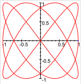
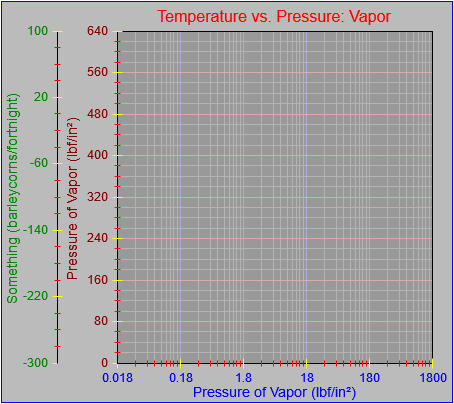
Also, notice that for the time being the solution only works for axes increasing in value from bottom to top (for the y-) and left to right (for the x-), where the partial cycle can only occur at the high end of the scale. There are two possible complications to the current set-up. One is that I can (and ultimately will) add the ability to reverse the direction of the scale on any axis. That would mean that the partial ending cycle would be at the bottom of a y-axis and the left side of a right axis. The other possible complication, which I may or may not ever address, involves the ability to define a scale that does not begin on a major tick boundary. That situation might come up if I want to generate a graph like this (from the Lissajous Curve app by Ying-Chou Sun, found in the iTunes App Store), though in reality it does end at major ticks:

As I’ve noted previously, I do plan to allow axes to take up arbitrary positions within the plotting area, as they do in this example.

Posted in Tools and methods | Tagged , | Leave a comment

Graph Project: Auto-Sizing Works — The Hard Part, Part One

Today’s updates involve ensuring that any number of axes can be properly placed on any side of the plotting area. Moreover, they will include space for tick marks that extend beyond the location of the axis itself.

I also corrected a couple of other minor issues. One was forgetting a beginPath statement before drawing bounding rectangles (they normally wouldn’t be drawn except as an illustration), which had the effect of changing the color of the last major tick drawn on every axis. You see it corrected in the final image below. The other was realizing that there was not a one-pixel overlap between the space required for the graph label at the top of the canvas and any elements that bordered it, it only seemed that way because the bounding box was drawn one pixel too low.

The first figure shows that the overlap with the top section is now corrected, and also that the spacing works as desired with the x-axis in the low position as well as the high.

The next figure shows that multiple axes can be placed on any side of the plot area and be spaced correctly. I initially thought it was going to more complex than it turned out to be, but I happily saw a way to insert just a few extra lines of code into an existing block.

The final figure shows that spacing of multiple axes on any one side of the plot area will properly allow space for ticks that extend inside an axis (axisTickStyle == “in” or “both”) and that the issue with accidentally changing the color of the last major tick has been corrected.

The last thing to do for this phase of development is extend the code so it properly handles cases where the final major tick does not fall at the end of an axis. That should be addressed tomorrow.

Posted in Tools and methods | Tagged , | Leave a comment

Graph Project: Auto-Sizing Works — The Easy Part

Today I got the main parts of the auto-sizing going again, though you can see it’s for the simple case when there is never more than one axis on a side (the support is there, I just haven’t finished the implementation for that case) and where major ticks always fall on the end of each axis. Handling major ticks that don’t fall on the end of axes is probably the most complex case.

I appear to have a one-pixel overlap with the main graph label and the x-axis in the high position, but you can see that the bottom margin is set based on the larger of the overflows from the y-axes on the left and right sides.

So far, so good.

Posted in Tools and methods | Tagged , | Leave a comment

Graph Project: Toward Getting Auto-Sizing Working Again

When I reworked the axes as separate objects I’ve been setting the plotting area and label locations by hand, as a hack/placeholder until I got all the pieces working again. I’ve still got a bit to go, but for now I’ve fixed it so I can place the labels automatically spaced beyond the tick value labels plus a specified buffer, and then account for a buffer outside of that. I use the information compiled to calculate a total distance in pixels perpendicular to the axis that the axis elements and buffers require. The information about how far the tick value labels extend past the plot area in each direction (left/right or top/bottom) is also tracked correctly, as you can tell by how the information is used to draw bounding boxes (in purple).

I’ve decided that rather than relying on buffers defined from the outer edges of the applicable drawing region that I would instead rely on buffers defined around all outer edges of the axes themselves. I have a buffer defined for outside of each element in a perpendicular direction going away from the axis but I see I need to add them for each end along the axis as well.

The current code also only calculates the overflow space off each end of an axis if major ticks fall right at the end of an axis, as they do in the accompanying figure. If a tick does not fall directly at the end of an axis the code then has to figure out how far away from the end it’ll be, which would not only reduce the overflow space, possibly to zero, but would also affect how the elements need to be placed. The issue is that the distance from the final major tick to the end of an axis is proportional to the length of the axis, but the placement of the axes might depend on the amount of overflow. The spacing calculations may therefore have to be performed iteratively, a process made even more complex by the possibility that multiple axes may be present. That should be a treat to figure out…

Once all of these items are implemented I can get to work on making all items place themselves from outside in and define the plot area which remains (and also determine if not enough space remains). I also have to make sure I account for whether the labels are drawn or not in the calculation of pixels required perpendicular to the axes. So far I’ve just assumed that they’re going to be drawn.

The current code assumes that x-axis labels (the main ones, not those for each tick value) will be printed in their normal, horizontal orientation while the y-axis labels will be displayed rotated counter-clockwise by 90 degrees whether the axis is displayed on the left (low) or right (high) side of the graph. If I decide to change that rotation to 90 degrees clockwise either by default or user parameter I’ll have to make a few more tweaks still. The placement of those labels requires that the height of the letters’ height and descenders be accumulated in the proper order. If I allow rotation in the other direction I’ll have to reverse things and add more switches.

I need to tweak the placement of the bounding rectangle by a pixel or two here and there to ensure I’m summing up the perpendicular distances exactly right. At the moment it looks like I’m about two pixels too narrow. I’ll review that as part of tomorrow’s work.

Finally, I think I may also shorten the tick lines drawn across the plotting area by a pixel, so they don’t overlap the bounding line on the far side of the plot, as is seen here along the bottom edge.

Posted in Tools and methods | Tagged , | Leave a comment

Graph Project: Labels Rotated Properly In Every Location

Today’s work was to get the tick value labels to handle rotation correctly, which they now do whichever side the labels are on. I also realized that I had cleverly defined rotations for the x-axis to go in the opposite direction from those on the y-axis, which is, how shall I say, not actually so clever. I therefore changed it so positive rotation always means clockwise (all labels in the figure are rotated positive 30 degrees) and negative always means counter-clockwise. That should make sense to users.

Posted in Tools and methods | Tagged , | Leave a comment

Graph Project: Axes On Other Side Of Plot

Here I’ve modified the code to not only accept extra axes, but also to be able to place them on either side of the plot area. This is reflected in the location of the tick and axis labels relative to the axis locations (in both the x and y directions) and the meaning of the “in” vs. “out” setting of the tick marks, all of which are presently set to “out” rather than “both” as they have been.

Next I’ll review how the rotations work from the other side. That should be a bit more involved.

Posted in Tools and methods | Tagged , | Leave a comment

Graph Project: Multiple Axes

Now that the axis objects have been split out from the main graph object it’s a simple matter to add in as many as you need, as seen in the image. This example shows parallel axes stacked side to side, but it would be easy to imagine plots being stacked lengthwise, as is often seen in dual plots of stock price and trading volume by time period.

Note that the second axis in either direction would usually be drawn adjacent to the other side of the plot area, which would also require that the elements be drawn in the other direction from the base location of the axis. That will involve more parameters and code, which I believe will be tomorrow’s project.

Also, every decision you make has unexpected consequences. For example, I initially assumed that the axes would always meet in the lower left corner of the graph and for some reason decided that tick marks in that corner should not be drawn over the axes in that corner. This looks OK when the axes do, in fact, meet in that corner, but not so good when they don’t. One case where that may happen is where an axis intersects a perpendicular axis at an arbitrary location and another is when an axis floats away from the plot area as shown here. In that case it just looks stupid.

Here are a few things that need to happen:

  • Ticks specified to cross an axis should be drawn that way no matter where they fall.
  • The spacing and buffers within and around each axis element have to be reconsidered.
  • Once the axis elements are reworked the ability to click on the related area should be added, as a way to kick off user modification processes.
  • The labels are drawn relative to the location of the axis, but the axis itself may need to be able to be drawn in a different spot, and the parameters needed to keep track of all that need to be added.
    • The location of axis endpoints should be specified as it is currently.
    • Tick labels should always be drawn close to that location.
    • The axis label should be drawn just outside the tick labels.
    • The axis itself should be drawn based on where it intersects an axis perpendicular to it, by value for that axis and not by pixel.
    • It’s possible that ticks should be drawn close to the tick labels and on an axis display in the middle of a plot area. Maybe.
    • Buffer spaces should be defined between all elements: inner tick to axis (if that axis is floating and not on or directly adjacent to the plot area), axis or tick to tick label, tick label to axis label, axis label to outer buffer. That should provide enough information to allow all axes to space themselves relative to the specified edge of the graph object, the plot area, and other axes in the same direction.
  • If multiple axes are to be drawn, then certain limits may need to be placed on them:
    • Floating axes should not be able to be longer than the one(s) adjacent to the plot area.
    • If automatic sizing is to be attempted (I had it, but for the time being I’ve lost it), the end buffer space requirements of the axis that takes up the most pixels should govern the required end buffer space for all parallel axes.
    • In theory, no more than one axis in either direction should be able to be drawn somewhere in the middle of the plot area, away from its labels.
    • Similarly, only one axis in either direction should be able to generate background lines on the plot area, and that should probably be the first one listed, one directly adjacent to the plot area, and probably the primary axis on the left side or the bottom.
    • It may be possible to stack axes along their length instead of side to side as shown. Consider a display that shows stock prices and ranges by day in a large, upper section and the volume traded by day in a smaller, lower section, as described above. On the other hand, it would be just as simple to do the same thing using two separate graphs, or some new type of object using polymorphism and inheritance.
    • At some point, if things get too crazy, it may not be possible to automatically place all elements. Some user intervention may be needed.

I decided I’d keep working on things and updated the plotting functions for multiple axes. This involves passing not only the values through to the plotting routines but the relevant axes as well. Functions to determine the pixel location along each axis are called separately.

Of course, you now can’t tell which graph is associated with each axis, but that’s easy enough to address.

Posted in Tools and methods | Tagged , | Leave a comment

Graph Project: Splitting Axes Into Separate Objects

One of the problems with developing from a quick hack, as I have here, is that you sometimes have to take a step back and do some serious re-plumbing. In this case that means breaking things apart and defining axes as separate objects. That’s the way I actually did it the first time I executed this project. This has the benefit of allowing me to easily specify any number of axes and also cuts the amount of code and unique variable names almost in half from what I had. It took some doing over the weekend and this morning but I’m well on my way.

Not everything is quite as automated as it was but I’ll get back to that point over the next couple of days. In the meantime I’ve defined a plot area which is part of the graph object itself and each of the defined axes. I also defined a TextSizer object, one instance of which is defined as part of the graph object and references to which are passed to each axis object. That allows all entities to refer to the same instantiation. For now the TextSizer doesn’t do any more than the original custom sizing function(s) did, but a mechanism is in place that can be expanded and generalized as needed, so it can potentially handle a wider variety of fonts and pixel sizes. It may be a good idea to store reference to the plot area in the same way–or it might not. It’s the difference between storing four local coordinate values and going through the extra reference indirections to access the ones stored with the graph object (rather than the individual axes). My feeling is that saving the time for the extra reference indirections is worth giving up the extra storage for each axis object (even if they all contain the same information), but that’s just a gut feeling. I could go the other way if I decide that thee repetitive storage hurts my soul more than giving up a few clock cycles. Given the magnitude of the effects of the decision, which approaches zero, I think I’m going to stop thinking about it. I only report it because it may be worth describing how I subconsciously consider such issues at all times.

Finally, I added a few more complications to govern the display of the plotting area. I’ll go into some of the edge cases these brought up in the days ahead. They mainly have to do with the kind of lines that are drawn around the boundary of the plot area. It’s also clear that a designer would have to be careful not to specify that tick lines not be drawn across the plot area based on potentially incompatible locations from multiple axes in one direction (say, if two or more y-axes were specified with independent scales).

In the meantime, the figure below shows that I’m able to generate more or less the same display elements I could before, minus the actual function plot, so I know I haven’t lost anything. I left all the old code in place so one of the first things I’ll do going forward is comment out all the code and declarations that have been obviated, to ensure I don’t still have any hidden dependencies.

Posted in Tools and methods | Tagged , | Leave a comment

Graph Project: Automatically Generating Axis Labels

Up until not the graph object has required that the parameters governing the generation of axis tick labels be specified explicitly. However, it would be nice for the graph to be able to generate reasonable value labels on its own given the high and low range of data it’s supposed to plot. I decided that a) I wanted to make this happen and b) I’m not overly mad about the way I’ve seen it done by other software.

I have a few more scenarios to test (I haven’t looked at ranges that cross zero, i.e., that have both negative and positive values) but I did come up with a method that should generate roundish values across somewhere between six and eleven cycles.

I began with the observation that the size of the chosen interval should be based on the span of values (the difference between the highest and lowest values in a data set) and not by the magnitude of the values. Basically, I calculate the span, divide it by six, and then massage that value until it looks like a fairly rounded value of the appropriate magnitude. The code listing is shown farther down.

I wrote some code and tried a few range values but realized I needed to be more systematic and exhaustive, so I created an Excel worksheet that tested combinations of base values from 10-6 to 106 and ranges from 10-8 to 108, with some randomization thrown in for the first significant digit. It implemented the code in spreadsheet form and listed the expected results. You can see the patterns in the image, starting from column T and moving right.
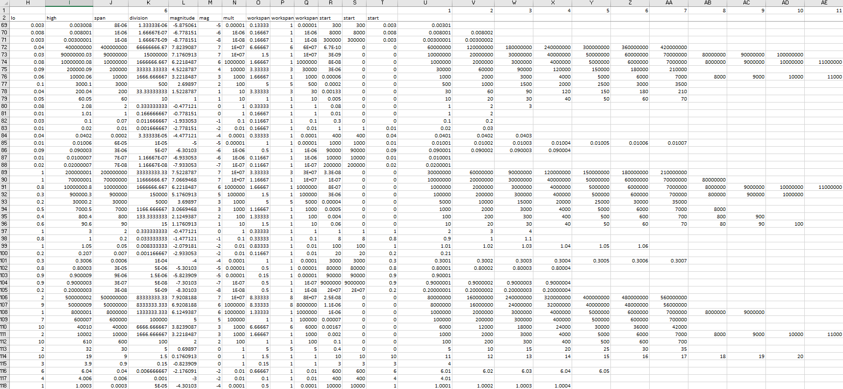
As you can see, some combinations of base and range yield only two or three values for the range, while other combinations yield up to a dozen (and other testing has indicated that more may be possible). I therefore found it necessary to add extra checks to divide the interval if there are too few and shrink the interval if there are too many. That said, I also found that the code behaves just a little bit differently than does the spreadsheet (it gives better results, I think the problem in the spreadsheet is in columns K and L, which corresponds to lines 7 to 15 in the code snippet), but the adjustments are occasionally still needed.

So far I’ve just written the code to generate the range values but I have not yet extended this to draw the values generated. That’s going to be interesting because the calculations generate unexpected results when some of the values cannot be represented exactly. Who can tell what’s going to happen when you think you’re supposed to get 0.002999, 0.003009, and 0.000001 but you actually get 0.0029990000000000004, 0.0030080000000000016, and 0.0000010000000000000002? Another issue is that combinations of very large and very small numbers (e.g., 4,700,000,000.0000007) cannot be represented; the least significant digits get truncated entirely.

Annoyances like this came up when I wrote code to generate graphs in the early 90s and they come up now, but that’s part of the game, isn’t it? Computers do what they do and you have to work around that. The formatting routines for displaying the tick values may or may not take care of these issues so we’ll see how it goes. If they don’t, then I’m going to add some extra manipulations.

I’ll be testing this going forward and describe any further modifications I identify.

Posted in Tools and methods | Tagged , | Leave a comment

Completing the Logarithmic Scale Implementation

Today I was able to finish the implementation of logarithmic scales on both axes. Even better, I added the ability to specify a major interval for each axis separately. This value is used to determine the number of cycles and thus major ticks for linear axes; the number of intervals is determined automatically for logarithmic axes. A happy side effect of this was that axes can now display an arbitrary number of cycles in linear or logarithmic mode, as shown in the figure below. I also rearranged the code to be more modular and generalized.

Posted in Software | Tagged , | Leave a comment