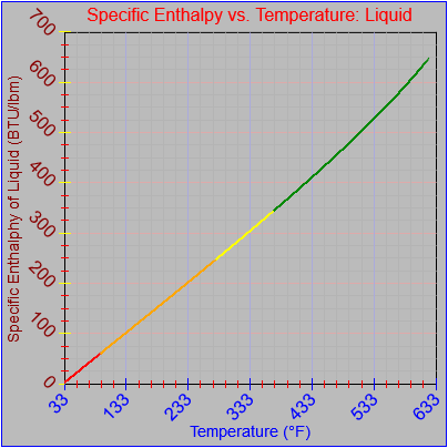
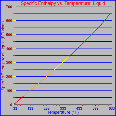
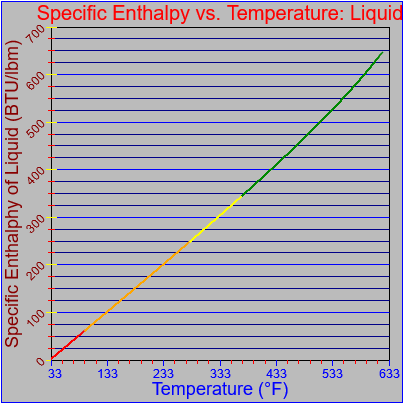
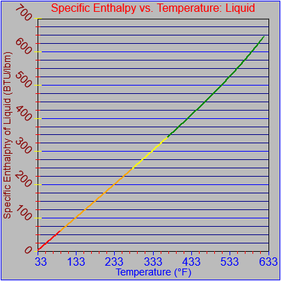
function TFind_P(T) {
var temp = 0.0;
if (T < -40.0) {
graphCycle = graphCycleBottom0;
temp = 0.0;
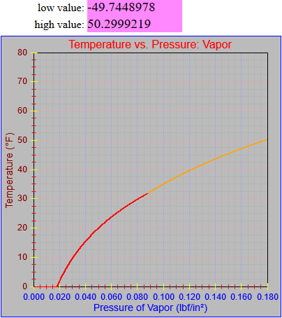
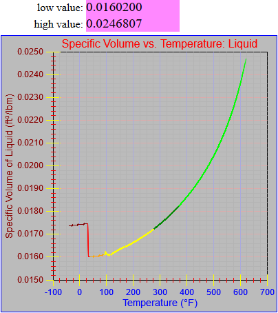
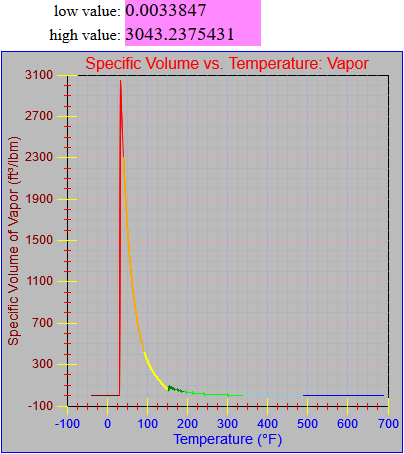
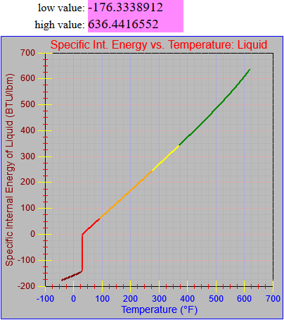
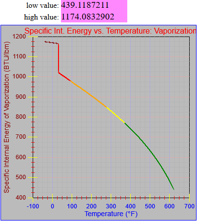
} else if (T < 32.018) {
graphCycle = 1;
T = T + 4.00000000000000E+0001 + 2;
temp = -5.82750190795537E-0004;
temp += ( 3.10138202245116E-0004 * T);
temp += (-9.96845835382852E-0006 * T * T);
temp += ( 2.93452465077397E-0007 * T * T * T);
temp += 1.90000000000000E-0003;
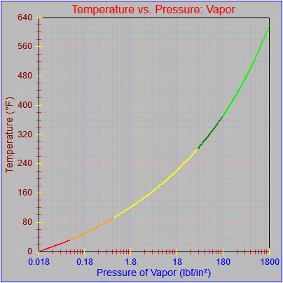
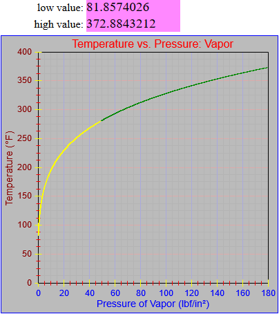
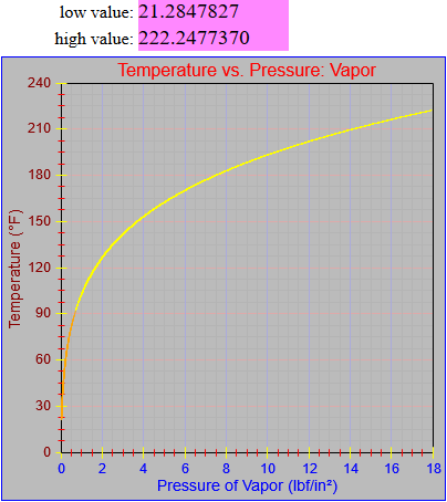
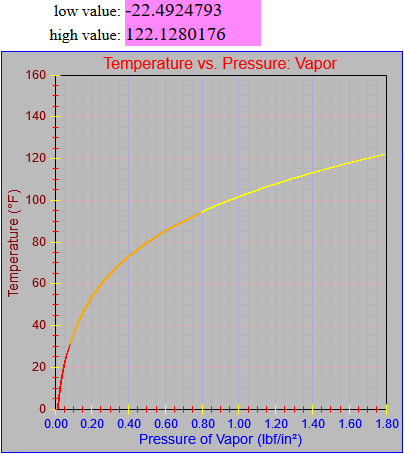
} else if (T <= 95) {
graphCycle = 2;
temp = 1.02291643993728E-0001 * T;
temp += (-1.56461430882940E+0001 / T);
temp += (-7.77500161911500E-0001 * Math.sqrt(T));
temp += (-5.68581901662451E-0001 * Math.log(T));
temp += (-5.57135053654371E-0004 * T * T);
temp += ( 2.68643222990479E-0006 * T * T * T);
// temp += 4.06678025391659E+0000 + 8.86600000000000E-0002;}
temp += 4.15544025391659E+0000;
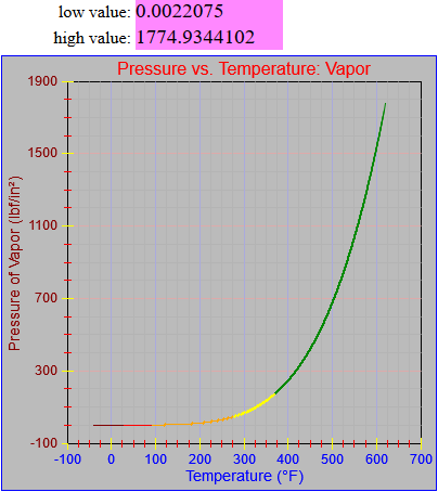
} else if (T <= 281.03) {
graphCycle = 3;
temp = 3.92079417112400E+0001 * T;
temp += ( 4.01213788918853E+0004 / T);
temp += (-1.28706905409880E+0003 * Math.sqrt(T));
temp += ( 3.50936122348532E+0003 * Math.log(T));
temp += (-3.40581930733492E-0002 * T * T);
temp += ( 3.01211718278793E-0005 * T * T * T);
temp += -7.30111133292317E+0003;
temp += 0.00000000000000E+0000;
} else if (T <= 373.13) {
graphCycle = 4;
temp = -4.46073180369288E+0003 * T;
temp += (-2.91401612241211E+0007 / T);
temp += ( 2.35876174171448E+0005 * Math.sqrt(T));
temp += (-1.02466834830570E+0006 * Math.log(T));
temp += ( 1.41416476892482E+0000 * T * T);
temp += (-3.85708716196032E-0004 * T * T * T);
temp += 3.07749988717651E+0006;
temp += 5.00000000000000E+0001;
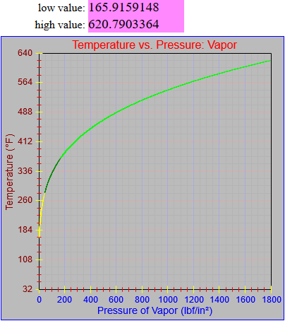
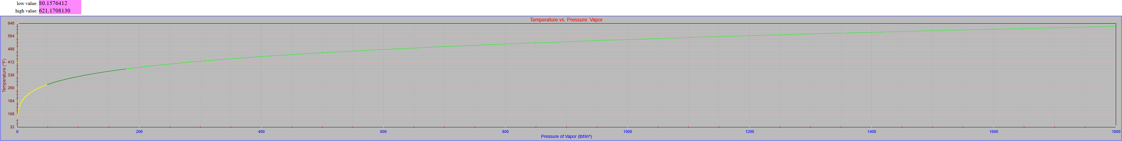
} else if (T <= 621.21) {
graphCycle = 5;
temp = 6.08822615030408E+0003 * T;
temp += ( 6.96757841217041E+0007 / T);
temp += (-3.68132442183495E+0005 * Math.sqrt(T));
temp += ( 1.83794467631912E+0006 * Math.log(T));
temp += (-1.51896496594964E+0000 * T * T);
temp += ( 3.61841945230257E-0004 * T * T * T);
temp += -6.03886787577057E+0006;
temp += 1.80000000000000E+0002;
} else {
graphCycle = graphCycleTop0;
temp = 0.0;
}
return temp;
}