<!doctype html>
<html>
<head>
<title>Graph Object</title>
<meta charset="utf-8" />
<meta http-equiv="Content-type" content="text/html; charset=utf-8" />
<meta name="viewport" content="width=device-width, initial-scale=1" />
<style>
body {
background-color: #FFFFFF;
}
</style>
</head>
<body>
<script>
var graphCycle = 0;
var graphCycleBottom0 = 0;
var graphCycleTop0 = 0;
//graph object
function graph(width,height,id) {
this.id = id;
this.canvas = document.getElementById(id);
if (this.canvas) {
//element already exists
if (this.canvas.nodeName == "CANVAS") {
//element *is* a canvas
this.width = this.canvas.width;
this.height = this.canvas.height;
} else {
//element is *not* a canvas
alert("Error: Element you've linked to is *not* a canvas.");
}
} else {
//element does not already exist and must be created
this.width = width;
this.height = height;
this.canvas = document.createElement("canvas");
this.canvas.id = this.id;
this.canvas.width = this.width;
this.canvas.height = this.height;
document.body.appendChild(this.canvas);
}
this.canvas.style.border = "1px solid green";
this.canvas.style.margin = "5px auto";
this.ctx = this.canvas.getContext("2d");
this.ctx.lineWidth = 1.0;
this.ctx.lineCap = "square";
this.ctx.fillStyle = "#FFFFFF";
this.ctx.fillRect(0,0,this.width,this.height);
//these values govern drawing of color-segmented curves
this.graphCycleBottom0 = 0;
this.graphCycleTop0 = 12;
this.colorArray = ["#7777777","#800000","#FF0000","#FFA500","#FFFF00","#008800","#00FF00","#87CEEB","#0000FF","#4B0082","#FF00FF","#800080","#7777777"];
//setters, getters don't appear to be needed
this.setBackgroundColor = function(color) {
this.backgroundColor = color;
};
this.setBorderColor = function(color) {
this.borderColor = color;
};
this.setXaxis_X1 = function(xaxis_x1) {
this.xaxis_x1 = xaxis_x1;
}
this.setXaxis_Y1 = function(xaxis_y1) {
this.xaxis_y1 = xaxis_y1;
}
this.setXaxis_X2 = function(xaxis_x2) {
this.xaxis_x2 = xaxis_x2;
}
this.setXaxis_Y2 = function(xaxis_y2) {
this.xaxis_y2 = xaxis_y2;
}
this.setYaxis_X1 = function(yaxis_x1) {
this.yaxis_x1 = yaxis_x1;
}
this.setYaxis_Y1 = function(yaxis_y1) {
this.yaxis_y1 = yaxis_y1;
}
this.setYaxis_X2 = function(yaxis_x2) {
this.yaxis_x2 = yaxis_x2;
}
this.setYaxis_Y2 = function(yaxis_y2) {
this.yaxis_y2 = yaxis_y2;
}
this.setXaxisColor = function(xaxisColor) {
this.xaxisColor = xaxisColor;
}
this.setYaxisColor = function(yaxisColor) {
this.yaxisColor = yaxisColor;
}
this.setXaxisLabel = function(xaxisLabel) {
this.xaxisLabel = xaxisLabel;
}
this.setYaxisLabel = function(yaxisLabel) {
this.yaxisLabel = yaxisLabel;
}
this.setXaxisFontColor = function(xaxisFontColor) {
this.xaxisFontColor = xaxisFontColor;
}
this.setYaxisFontColor = function(yaxisFontColor) {
this.yaxisFontColor = yaxisFontColor;
}
this.setGraphLabel = function(graphLabel) {
this.graphLabel = graphLabel;
}
this.setGraphLabelColor = function(graphLabelColor) {
this.graphLabelColor = graphLabelColor;
}
this.setXmajorTicks = function(xmajorTicks) {
this.xmajorTicks = xmajorTicks;
}
this.setYmajorTicks = function(ymajorTicks) {
this.ymajorTicks = ymajorTicks;
}
this.setXminorTicks = function(xminorTicks) {
this.xminorTicks = xminorTicks;
}
this.setYminorTicks = function(yminorTicks) {
this.yminorTicks = yminorTicks;
}
this.setXmajorTickColor = function(xmajorTickColor) {
this.xmajorTickColor = xmajorTickColor;
}
this.setYmajorTickColor = function(ymajorTickColor) {
this.ymajorTickColor = ymajorTickColor;
}
this.setXminorTickColor = function(xminorTickColor) {
this.xminorTickColor = xminorTickColor;
}
this.setYminorTickColor = function(yminorTickColor) {
this.yminorTickColor = yminorTickColor;
}
this.setXmajorTickLength = function(xmajorTickLength) {
this.xmajorTickLength = xmajorTickLength;
}
this.setYmajorTickLength = function(ymajorTickLength) {
this.ymajorTickLength = ymajorTickLength;
}
this.setXminorTickLength = function(xminorTickLength) {
this.xminorTickLength = xminorTickLength;
}
this.setYminorTickLength = function(yminorTickLength) {
this.yminorTickLength = yminorTickLength;
}
this.setXvalMinOuter = function(xvalMinOuter) {
this.xvalMinOuter = xvalMinOuter;
}
this.setXvalMaxOuter = function(xvalMaxOuter) {
this.xvalMaxOuter = xvalMaxOuter;
}
this.setYvalMinOuter = function(yvalMinOuter) {
this.yvalMinOuter = yvalMinOuter;
}
this.setYvalMaxOuter = function(yvalMaxOuter) {
this.yvalMaxOuter = yvalMaxOuter;
}
this.setXvalMin = function(xvalMin) {
this.xvalMin = xvalMin;
}
this.setXvalMax = function(xvalMax) {
this.xvalMax = xvalMax;
}
this.setYvalMin = function(yvalMin) {
this.yvalMin = yvalMin;
}
this.setYvalMax = function(yvalMax) {
this.yvalMax = yvalMax;
}
this.setPixelOffset = function(pixelOffset) {
this.pixelOffset = pixelOffset;
}
this.setGraphCycle = function(graphCycle) {
this.graphCycle = graphCycle;
}
this.resetCurve = function() {
this.lowVal = 99999999999.0;
this.highVal = -99999999999.0;
this.x0 = 0.0;
this.y0 = 0.0;
this.x1 = 0.0;
this.y1 = 0.0;
this.move = 0;
this.line = 1;
this.graphCycle = -1;
this.oldCycle = -1;
}
this.drawAxes = function() {
//set up font
this.ctx.font = "12px Arial"; //TODO: parameterize this by element
this.ctx.textAlign="center"; //TODO: parameterize this by element
//draw y-axis label rotated before doing anything else
//this only works once
var x = 12.0 + this.pixelOffset; //TODO: parameterize this by element
var y = Math.floor((this.yaxis_y1+this.yaxis_y2) * 0.5) - this.pixelOffset; //TODO: parameterize this by element
this.ctx.fillStyle = this.yaxisFontColor;
//save original context and prepare
this.ctx.save();
this.ctx.translate(x,y);
this.ctx.rotate(-Math.PI * 0.5); //TODO: parameterize this by element
//draw the text;
this.ctx.fillText(this.yaxisLabel,0,3);
//restore the original context
this.ctx.restore();
//draw title
this.ctx.fillStyle = this.graphLabelColor;
x = Math.floor(this.canvas.width * 0.5) + this.pixelOffset; //TODO: parameterize this by element
y = 15.0 - this.pixelOffset; //TODO: parameterize this by element
this.ctx.fillText(this.graphLabel,x,y);
//x-axis
this.ctx.beginPath();
this.ctx.strokeStyle = this.xaxisColor;
this.ctx.moveTo(this.xaxis_x1+this.pixelOffset,this.xaxis_y1-this.pixelOffset);
this.ctx.lineTo(this.xaxis_x2+this.pixelOffset,this.xaxis_y2-this.pixelOffset);
this.ctx.stroke();
//y-axis
this.ctx.beginPath();
this.ctx.strokeStyle = this.yaxisColor;
this.ctx.moveTo(this.yaxis_x1+this.pixelOffset,this.yaxis_y1-this.pixelOffset);
this.ctx.lineTo(this.yaxis_x2+this.pixelOffset,this.yaxis_y2-this.pixelOffset);
this.ctx.stroke();
//y major and minor ticks
var ticks = (this.ymajorTicks)*(this.yminorTicks+1); //TODO: make scales on axes begin at arbitrary values and not just on major tick boundaries
var increment = (this.yaxis_y1-this.yaxis_y2) / ticks;
var minorCount = this.yminorTicks+1;
var majorCount = 0;
x = this.xaxis_x1 + this.pixelOffset;
var xend = this.xaxis_x2 + this.pixelOffset;
for (var t=0; t<=ticks; t++) {
y = Math.floor(this.xaxis_y1-increment*t)-this.pixelOffset;
this.ctx.beginPath();
if (minorCount > this.yminorTicks) { //draw major tick
this.ctx.strokeStyle = this.ymajorTickColor;
this.ctx.moveTo(x-this.ymajorTickLength,y);
if (t == 0) {
this.ctx.lineTo(x,y);
} else {
this.ctx.lineTo(xend,y); //TODO: separate drawing of ticks from drawing of lines in graph area
} //TODO: allow ticks to be drawn on both sides of an axis if so set
minorCount = 1;
//draw axis numbers here
this.ctx.strokeStyle = this.yaxisFontColor;
this.ctx.fillStyle = this.yaxisFontColor;
this.ctx.fillText(((this.yvalMin+(this.yvalMax-this.yvalMin)*(majorCount/this.ymajorTicks)).toFixed(1)),
this.xaxis_x1-28+this.pixelOffset,y+4); //TODO: parameterize the text location offsets
majorCount++;
}
else { //draw minor tick
this.ctx.strokeStyle = this.yminorTickColor;
this.ctx.moveTo(x-this.yminorTickLength,y);
this.ctx.lineTo(x,y);
minorCount++;
}
this.ctx.stroke();
}
//x major and minor ticks
ticks = (this.xmajorTicks)*(this.xminorTicks+1);
increment = (this.xaxis_x2-this.xaxis_x1) / ticks;
var minorCount = this.xminorTicks+1;
var majorCount = 0;
y = this.yaxis_y1 - this.pixelOffset;
for (var t=0; t<=ticks; t++) {
x = Math.floor(this.yaxis_x1+increment*t)+this.pixelOffset;
this.ctx.beginPath();
if (minorCount > this.xminorTicks) { //draw major tick
this.ctx.strokeStyle = this.xmajorTickColor;
this.ctx.moveTo(x,y+this.xmajorTickLength);
this.ctx.lineTo(x,y);
minorCount = 1;
//draw axis numbers here
this.ctx.strokeStyle = this.xaxisFontColor;
this.ctx.fillStyle = this.xaxisFontColor;
this.ctx.fillText(((this.xvalMin+(this.xvalMax-this.xvalMin)*(majorCount/this.xmajorTicks)).toFixed(1)),
x+this.pixelOffset,this.xaxis_y1+this.xmajorTickLength+12); //TODO: parameterize the text location offsets
majorCount++;
}
else { //draw minor tick
this.ctx.strokeStyle = this.xminorTickColor;
this.ctx.moveTo(x,y+this.xminorTickLength);
this.ctx.lineTo(x,y);
minorCount++;
}
this.ctx.stroke();
}
//draw x-axis label
x = Math.floor((this.xaxis_x1+this.xaxis_x2) * 0.5) + this.pixelOffset;
y = this.canvas.height - 6.0 - this.pixelOffset; //TODO: parameterize this
this.ctx.fillStyle = this.xaxisFontColor;
this.ctx.fillText(this.xaxisLabel,x,y);
}
this.plot = function(xval,yval) {
//check if new high or low since last curve reset
if ((yval < this.ylo) && (yval != 0.0)) {
this.ylo = yval;
}
if ((yval > this.yhi) && (yval != 0.0)) {
this.yhi = yval;
}
//check if x or y value outside of graphable range
var xEff = 0.0; //effective x value to be plotted
if (xval < this.xvalMinOuter) {
xEff = this.xvalMinOuter;
} else if (xval > this.xvalMaxOuter) {
xEff = this.xvalMaxOuter;
} else {
xEff = xval;
}
var yEff = 0.0; //effective y value to be plotted
if (yval < this.yvalMinOuter) {
yEff = this.yvalMinOuter;
} else if (yval > this.yvalMaxOuter) {
yEff = this.yvalMaxOuter;
} else {
yEff = yval;
}
this.xplot = Math.floor(this.xaxis_x1 + ((xEff-this.xvalMinOuter)/(this.xvalMaxOuter-this.xvalMinOuter)*
(this.xaxis_x2-this.xaxis_x1))) + this.pixelOffset;
this.yplot = Math.floor(this.yaxis_y1 - ((yEff-this.yvalMinOuter)/(this.yvalMaxOuter-this.yvalMinOuter)*
(this.yaxis_y1-this.yaxis_y2))) - this.pixelOffset;
}
this.coloredCurveSegment = function(op) {
//assumes the plot function has been called and that this.xplot and this.yplot have meaningful values
if (op == this.move) {
this.x0 = this.xplot;
this.y0 = this.yplot;
this.x1 = this.xplot;
this.y1 = this.yplot;
this.ctx.beginPath();
this.ctx.moveTo(this.x0,this.y0);
} else if (op == this.line) {
if (this.graphCycle != this.oldCycle) {
this.ctx.beginPath();
this.ctx.strokeStyle = this.colorArray[this.graphCycle];
this.oldCycle = this.graphCycle; //monitor whether this is used
this.ctx.moveTo(this.x1,this.y1);
}
this.x1 = this.xplot;
this.y1 = this.yplot;
if ((this.graphCycle != this.graphCycleTop0) && (this.graphCycle != this.graphCycleBottom0)) {
//draw the line segment if not jumping to or from undefined value at top or bottom of driving function range
this.ctx.lineTo(this.x1,this.y1);
this.ctx.stroke();
}
}
}
this.symbol = function(isymbol,icolor) {
this.ctx.strokeStyle = icolor;
if (isymbol == 1) {
//draw a cross
this.ctx.moveTo(this.xplot-3.0,this.yplot);
this.ctx.lineTo(this.xplot+3.0,this.yplot);
this.ctx.stroke();
this.ctx.moveTo(this.xplot,this.yplot-3.0);
this.ctx.lineTo(this.xplot,this.yplot+3.0);
this.ctx.stroke();
}
if (isymbol == 2) {
//draw an X
this.ctx.moveTo(this.xplot-3.0,this.yplot-3.0);
this.ctx.lineTo(this.xplot+3.0,this.yplot+3.0);
this.ctx.stroke();
this.ctx.moveTo(this.xplot+3.0,this.yplot-3.0);
this.ctx.lineTo(this.xplot-3.0,this.yplot+3.0);
this.ctx.stroke();
}
}
this.drawFunctionColoredCurve = function(func) { //assumes that function parameter sets needed values of graphCycle
var increment = (this.xvalMaxOuter-this.xvalMinOuter) / (this.xaxis_x2-this.xaxis_x1+1);
var x = this.xvalMinOuter;
var op = this.move;
do {
var y = func(x);
this.setGraphCycle(graphCycle); //set object value to global value set by function
this.plot(x,y);
this.coloredCurveSegment(op);
op = this.line;
x += increment;
} while (x <= this.xvalMaxOuter);
}
this.drawGraph = function() {
this.canvas.style.border = "1px solid " + this.borderColor;
this.ctx.fillStyle = this.backgroundColor;
this.ctx.fillRect(0,0,this.width,this.height);
this.drawAxes();
this.resetCurve();
this.drawFunctionColoredCurve(TFind_h_f);
};
}
bcGraph = new graph(400,400,"bcg");
bcGraph.setBorderColor("#0000FF");
bcGraph.setBackgroundColor("#BBBBBB");
bcGraph.setXaxis_X1(70.0);
bcGraph.setXaxis_Y1(360.0);
bcGraph.setXaxis_X2(380.0);
bcGraph.setXaxis_Y2(360.0);
bcGraph.setYaxis_X1(70.0);
bcGraph.setYaxis_Y1(360.0);
bcGraph.setYaxis_X2(70.0);
bcGraph.setYaxis_Y2(25.0);
bcGraph.setXaxisColor("#000000");
bcGraph.setYaxisColor("#000000");
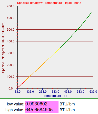
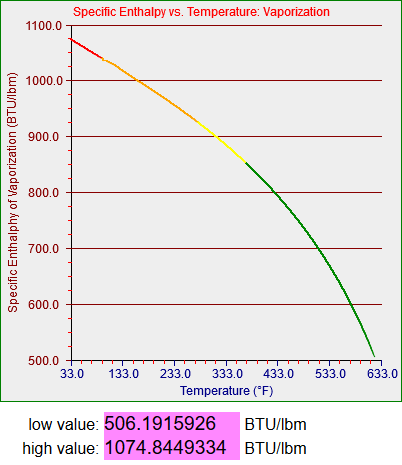
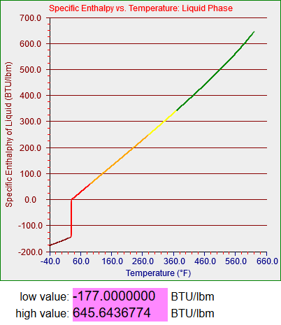
bcGraph.setXaxisLabel("Temperature (°F)");
bcGraph.setYaxisLabel("Specific Enthalphy of Liquid (BTU/lbm)");
bcGraph.setXaxisFontColor("#0000FF");
bcGraph.setYaxisFontColor("#880000");
bcGraph.setGraphLabel("Specific Enthalpy vs. Temperature: Liquid Phase");
bcGraph.setGraphLabelColor("#FF0000");
bcGraph.setXmajorTicks(6);
bcGraph.setYmajorTicks(7);
bcGraph.setXminorTicks(4);
bcGraph.setYminorTicks(3);
bcGraph.setXmajorTickColor("#888888");
bcGraph.setYmajorTickColor("#888888");
bcGraph.setXminorTickColor("#FF0000");
bcGraph.setYminorTickColor("#FF0000");
bcGraph.setXmajorTickLength(5);
bcGraph.setYmajorTickLength(5);
bcGraph.setXminorTickLength(3);
bcGraph.setYminorTickLength(3);
bcGraph.setXvalMinOuter(33.0);
bcGraph.setXvalMaxOuter(633.0);
bcGraph.setYvalMinOuter(0.0);
bcGraph.setYvalMaxOuter(700.0);
bcGraph.setXvalMin(33.0);
bcGraph.setXvalMax(633.0);
bcGraph.setYvalMin(0.0);
bcGraph.setYvalMax(700.0);
bcGraph.setPixelOffset(0.5);
bcGraph.drawGraph();
function TFind_h_f(T) {
var temp = 0.0;
if (T < -40.0) {
graphCycle = graphCycleBottom0;
temp = 0.0;
} else if (T < 32.018) {
graphCycle = 1;
T = T + 4.00000000000000E+0001 + 2.0;
temp = -8.62486040547143E-0001;
temp += ( 4.30266497429456E-0001 * T);
temp += ( 4.88261422057819E-0004 * T * T);
temp += -1.77000000000000E+0002;
} else if (T < 95.0) {
graphCycle = 2;
T = T - 3.20180000000000E+0001 + 2.0;
temp = -2.00215934711505E+0000;
temp += ( 1.00107967355752E+0000 * T);
temp += 1.00000000000000E-0002;
} else if (T <= 281.03) {
graphCycle = 3;
temp = -4.69729065930005E+0001 * T;
temp += (-9.74607390973568E+0004 / T);
temp += ( 1.90835053035617E+0003 * Math.sqrt(T));
temp += (-6.20932533077151E+0003 * Math.log(T));
temp += ( 2.66267491701626E-0002 * T * T);
temp += (-1.27691940626784E-0005 * T * T * T);
temp += 1.49281343450844E+0004;
temp += 6.97399999999907E+0001;
} else if (T <= 373.13) {
graphCycle = 4;
temp = 2.05053732381165E+0004 * T;
temp += ( 1.20426776893188E+0008 / T);
temp += (-1.05240833785439E+0006 * Math.sqrt(T));
temp += ( 4.44871141563416E+0006 * Math.log(T));
temp += (-6.98757084476529E+0000 * T * T);
temp += ( 2.13944594740312E-0003 * T * T * T);
temp += -1.31281338246765E+0007;
temp += 2.50239999999991E+0002;
} else if (T <= 621.21) {
graphCycle = 5;
temp = 3.07047527451813E+0003 * T;
temp += ( 3.65972248729248E+0007 / T);
temp += (-1.87934826001644E+0005 * Math.sqrt(T));
temp += ( 9.48190966569901E+0005 * Math.log(T));
temp += (-7.37055799842892E-0001 * T * T);
temp += ( 1.60163285570558E-0004 * T * T * T);
temp += -3.13433195117950E+0006;
temp += 3.46290000000037E+0002;
} else {
graphCycle = graphCycleTop0;
temp = 0.0;
}
return temp;
}
// / <- this little bit of bizarre is needed to ensure the Crayon WordPress add-in doesn't try to interpret things as comments strangely
</script>
</body>
</html>