
The introductory animation on my website has been a source of annoyance for me for some time. It never scaled properly on Android devices. It worked fine on every other browser I was able to test (IE, Edge, Firefox, Chrome, Opera, and Safari on Windows and Mac, and iOS and even Chrome on iPhone and iPad). Whenever I looked at it on a friend’s Android phone the text elements being animated all looked askew, as if the parent div was too small or the text items were too large.
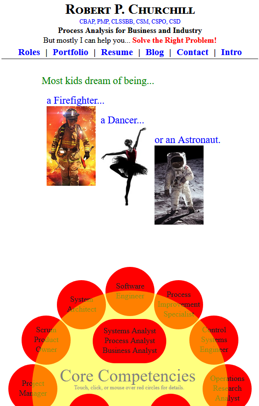
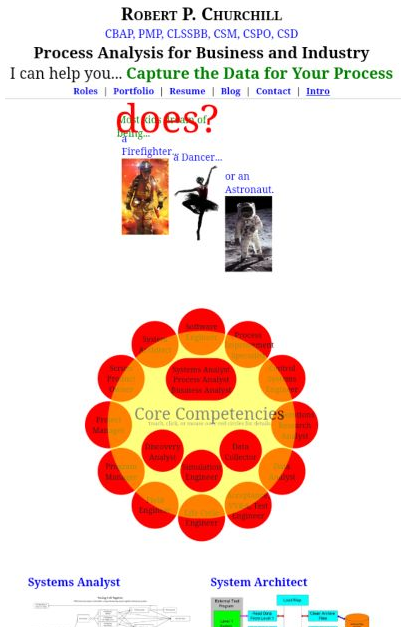
Here’s how the first couple pages of the animations look — and should look — on any desktop browser:
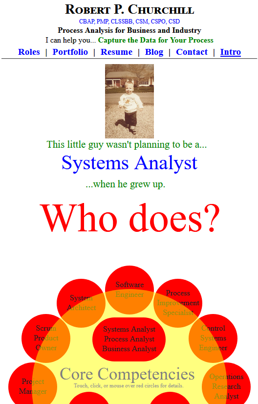
Here’s how they look — and again should look — on iOS devices:
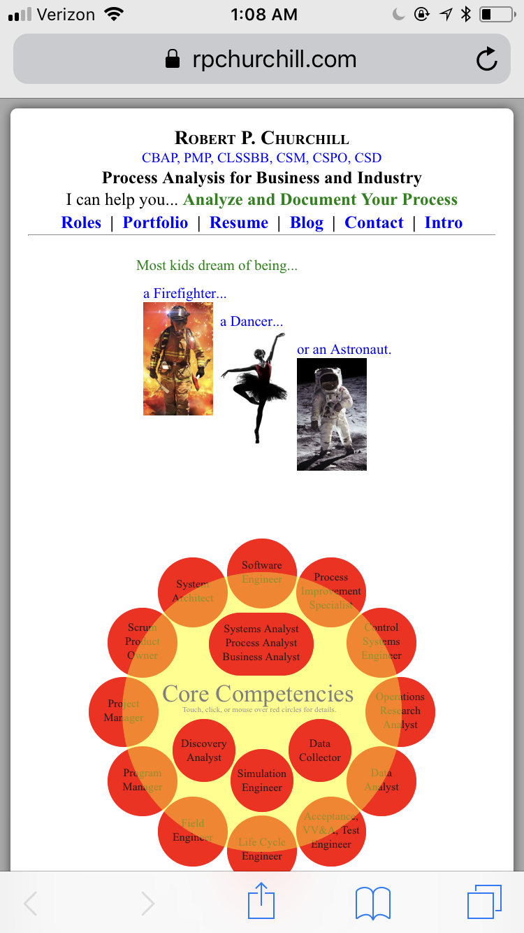
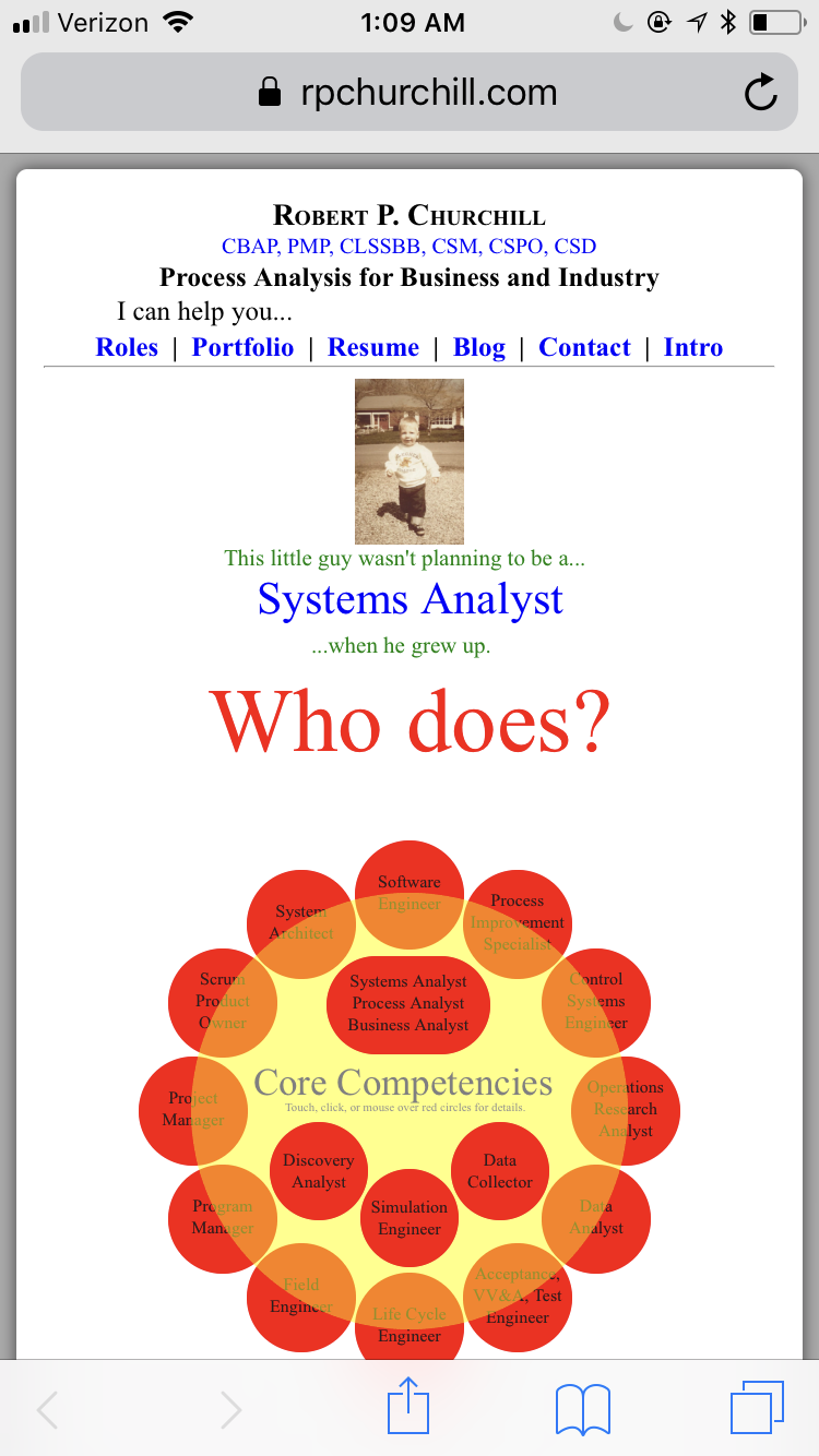
Here’s how they get incorrectly rendered on Android:
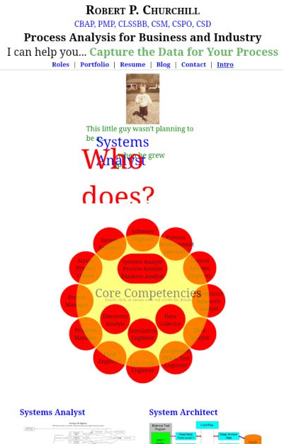
The only Android device I own is a Kindle Fire 8, and I had to do screen captures on my desktop while remotely debugging the landing page of my website. I suppose I could have done screencaps directly from the Fire and transferred them to my PC (like I did with the iPhone) but I was already using that setup to inspect the size and CSS provenance of elements so that was easier. That investigation showed me that Android wasn’t resizing the parent div but was instead rendering the text too large. The upper left corner of the text elements always end up in the right place but the letters are too long and the single-line elements often wrap to a second line.
As an side I’m going to ignore some of the other relative scaling issues that are going on. Keen observers will note that the graphic elements (the circles) take on different sizes on the three platforms relative to the text in the header (and in the animation). Something you can’t see is that the Android device compresses things so that two columns of articles are displayed below the circles. Only one column is typically displayed at the resolution of the iPhone or a similar width of a desktop browser. That’s because the pixel width of the Android/Fire/Silk browser is greater than the media setting for that page. The graphic and other elements are rendered slightly differently on each platform. A lot of this has to do with a meta setting in the header section of the HTML.
|
1 |
<meta name="viewport" content="width=750, initial-scale=0.5"> |
The decisions the different browsers make on those issues are agreeable and I don’t concern myself with them. The scaling of text in the animation section, however, is not agreeable, and that’s what I’m trying to fix.
So why is this happening? My initial reading and experimentation suggests that the Android browser assumes a different default value for font-size than the other browsers. Most browsers assume, I think, 16px for the default font-size, while the Android browser assumes something a bit larger, in the neighborhood of 20px or 24px.
I tried a few things, like setting the font-size to 16px in the HTML tag of the site’s global stylesheet.css file, but that didn’t solve the problem. The text elements in the animation, like all of the other elements, are created using the bcInitElement function, the final parameter of which contains the text string that defines the HTML and inline CSS definition of the element. See the following example (and see here for the history of how this got developed).
|
1 2 3 4 5 6 7 8 9 10 11 12 13 14 15 16 17 18 19 20 21 22 23 24 25 26 27 28 29 30 31 32 33 34 35 36 37 38 39 |
var i0 = document.getElementById("intro00"); bcInitElement(i0,"401px","30px","green","rgba(0,0,0,0)","250px","1","block","<span style='font16'>Most kids dream of being...</span>"); bcDefineLeftTween("i0",400,20,0.0,0.5,"linear"); bcDefineHideTween("i0",3.25); var i1 = document.getElementById("intro01"); bcInitElement(i1,"410px","70px","blue","rgba(0,0,0,0)","130px","1","block","a <span style='font24'>Firefighter</span>...<br /><img src='firefighter_001_sm.jpg' width='100px'>"); bcDefineLeftTween("i1",410,30,0.25,0.5,"linear"); bcDefineHideTween("i1",3.25); var i2 = document.getElementById("intro02"); bcInitElement(i2,"520px","110px","blue","rgba(0,0,0,0)","120px","1","block","a <span style='font24'>Dancer</span>...<br /><img src='ballet_001_sm.jpg' width='100px'>"); bcDefineLeftTween("i2",520,140,0.5,0.5,"linear"); bcDefineHideTween("i2",3.25); var i3 = document.getElementById("intro03"); bcInitElement(i3,"630px","150px","blue","rgba(0,0,0,0)","150px","1","block","or an <span style='font24'>Astronaut</span>.<br /><img src='astronaut_001_sm.jpg' width='100px'>"); bcDefineLeftTween("i3",630,250,0.75,0.5,"linear"); bcDefineHideTween("i3",3.25); var i4 = document.getElementById("intro04"); bcInitElement(i4,"30px","400px","green","rgba(0,0,0,0)","340px","1","block","<img src='RPC_classic.jpg' width='100px' class='billetHeat'>This little guy wasn't planning to be a..."); bcDefineTopTween("i4",410,10,3.25,0.5,"linear"); bcDefineHideTween("i4",8.35); var i5 = document.getElementById("intro05"); bcInitElement(i5,"60px","400px","blue","rgba(0,0,0,0)","290px","1","block","<span style='font-size:2em'>Systems Analyst</span>"); bcDefineTopTween("i5",586,186,3.5,0.5,"linear"); bcDefineHideTween("i5",8.35); var i6 = document.getElementById("intro06"); bcInitElement(i6,"110px","400px","green","rgba(0,0,0,0)","170px","1","block","...when he grew up."); bcDefineTopTween("i6",642,242,3.75,0.5,"linear"); bcDefineHideTween("i6",8.35); var i7 = document.getElementById("intro07"); bcInitElement(i7,"15px","-130px","red","rgba(0,0,0,0)","380px","1","block","<span style='font-size: 4em'>Who does?</span>"); bcDefineTopTween("i7",-130,275,6.25,0.1,"linear"); bcDefineHideTween("i7",8.35); |
The function creates a div with a specific width that gets moved around during the animation process. The text (or other element, like an image) gets defined and modified in the HTML parameter text. You can see above that I alternately apply different font-size parameters using class definitions and em multiples. Inspecting the text elements in the remote debugger shows that all previous size definitions are overridden so these are the only ones having an effect.
Well, almost the only ones. The .introPanel class applies a font-size multiple of 1.3 to all of the text elements.
|
1 2 3 4 5 6 7 8 9 10 11 12 13 14 15 16 17 18 19 20 21 22 23 |
//from the style section .introPanel { position: absolute; background-color: blue; left: 5px; font-size="16px"; -webkit-text-size-adjust:none; font-size: 1.3em; } //from the HTML section <div id="intro_div"> <div id="intro00" class="introPanel"></div> <div id="intro01" class="introPanel"></div> <div id="intro02" class="introPanel"></div> <div id="intro03" class="introPanel"></div> <div id="intro04" class="introPanel"></div> <div id="intro05" class="introPanel"></div> <div id="intro06" class="introPanel"></div> <div id="intro07" class="introPanel"></div> ... ... </div> |
If I comment out that multiple of 1.3 the text looks about right on the Android devices (not exactly, but much closer) but looks much smaller than it should be on everything else.
I also tried setting the initial-scale factor in the meta line described above to 1.0 instead of 0.5. That changed the relative scaling of certain things, but not the text items I wanted to change.
I’m out of time for today, but tomorrow I’ll do some organized experiments to see just what’s cascading off of what. If I were doing the same kind of thing using HTML canvas I would have far more information about the text elements rendered, because I can query the pixel width of a run of text directly. When doing HTML/CSS/JavaScript animations there’s a lot more machinery in the way, and that may limit the ultimate placement accuracy I can achieve on all platforms. Oh well, I think I’d hardly be the first person to have to accept a certain amount of drift in presentations like this.